Three years late but I did this chart for somewhere else so thought would be shame to waste it. It shows for all 533 English parliamentary constituencies Chris Hanretty’s estimated (in some cases actual) Leave % vote v their ranked Index of Multiple Deprivation (lower = more deprived).
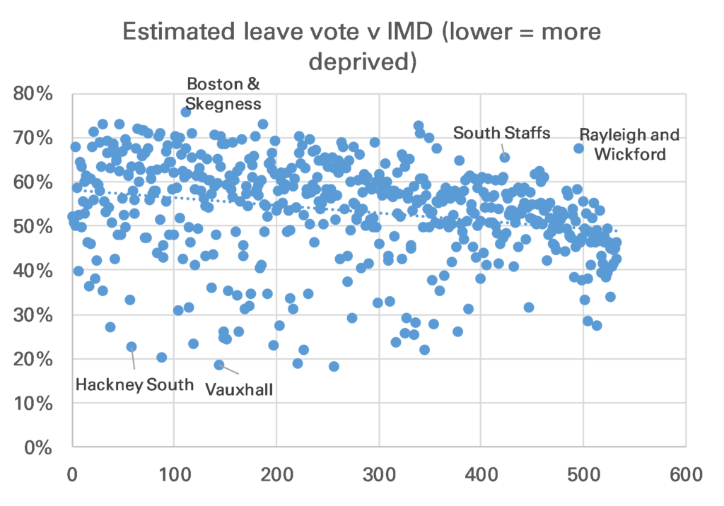
There is relationship been deprivation ranking & tendency to vote leave, though it is quite weak.
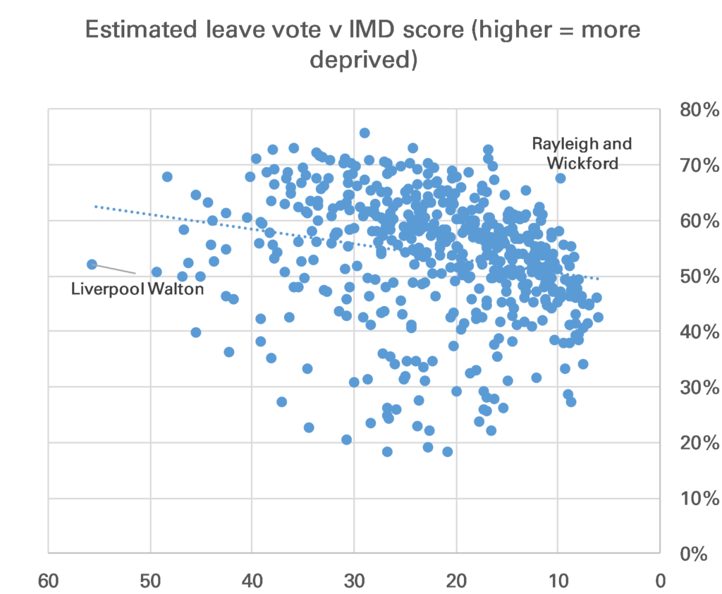
The ranking was done because that is how the original chart, which was on electoral party allegiance was done. It is more illustrative to show IMD as a score. Now the relationship 1 looks a little better but statistically it is still weak. Not lest because Liverpool Walton, by far the most deprived constituency on the IMD, only just voted Leave.
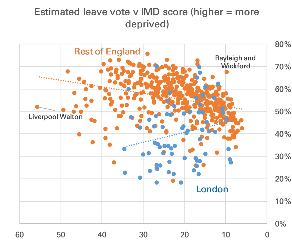
One correction that one might want to make is to show London separately. I don’t really like doing this as I’ve never bought the idea that London is that different from the rest of England. However in this case there is good reason to do so. London constituencies look relatively bad on an IMD basis, mainly because most do have large pockets of deprivation, but also because crime is high, and housing provision is said 2 to be poor.
Once you separate London the correlation between Leave vote and IMD in the rest of England is stronger, though still not overwhelming.
Finally, it’s worth noting that this analysis does not tell us which voters in each constituency voted Leave or Remain.