Chinese industry – doing worse & better than the headlines say

I don’t like monthly YoY data. For sure it has its advantages, in particular seasonality is normally dealt with. 1 But as a guide to what happened in the month in question it it rather lacking.

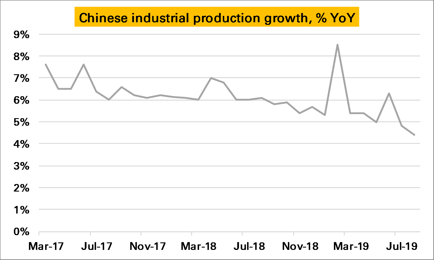
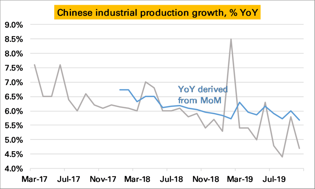
Chinese industrial production, an important datapoint for commodity demand (and the wider global economy), is normally reported as a YoY series. This has slowed steadily, and in October was just 4.7% higher YoY, a sharp slowdown from the 5.8% growth seen in September (grey line in 1st chart). However it remained higher than the low of 4.4% seen in August.

The probem with a YoY series is we don’t know whether October was a bad month, or October 2018 was a very good month, and similarly how it compares to September.

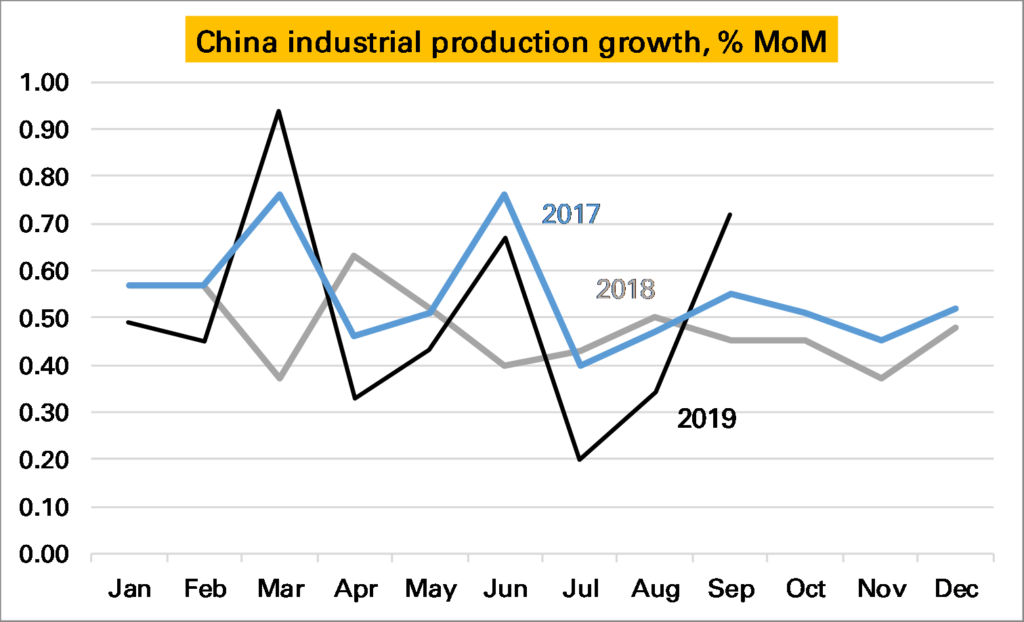
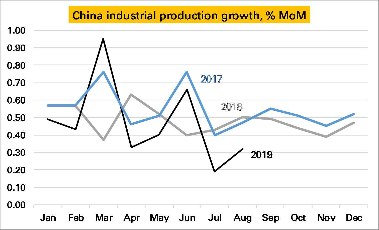
Luckily for IP, China also publishes a seasonally adjusted month-on-month (MoM) series. It doesn’t get much attention but in theory should give us a much more accurate read on how the industrial sector is doing at the moment. If so it looks very bad news – October saw growth of just 0.17% a month. This is the lowest monthly print I can remember, and as the following chart shows certainly the lowest in the last three years. If maintained for the next 12 months Chinese YoY IP growth would be just 2%.

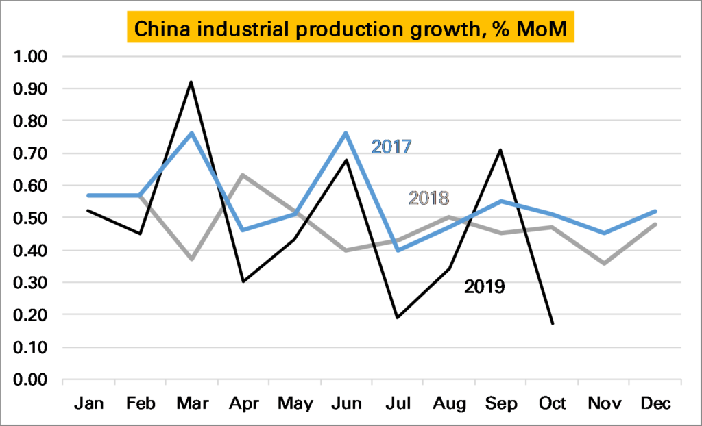
But the chart above also shows something else – the seasonally adjusted monthly growth rate appears rather…seasonal…especially in 2019. The first month of each quarter has been weak, and the last month strong. As such it looks like November’s print is likely to be around the same as in 2018 and December’s much stronger than in 2018. This would mean the YoY rate should stay around the same in November and rise strongly in December.

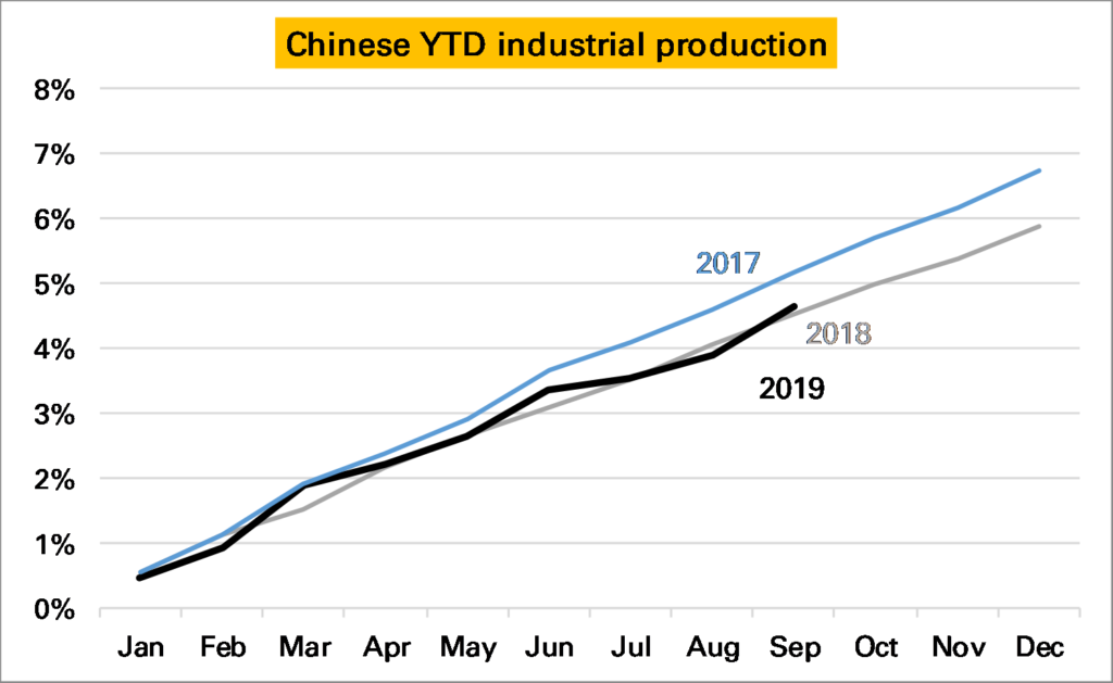
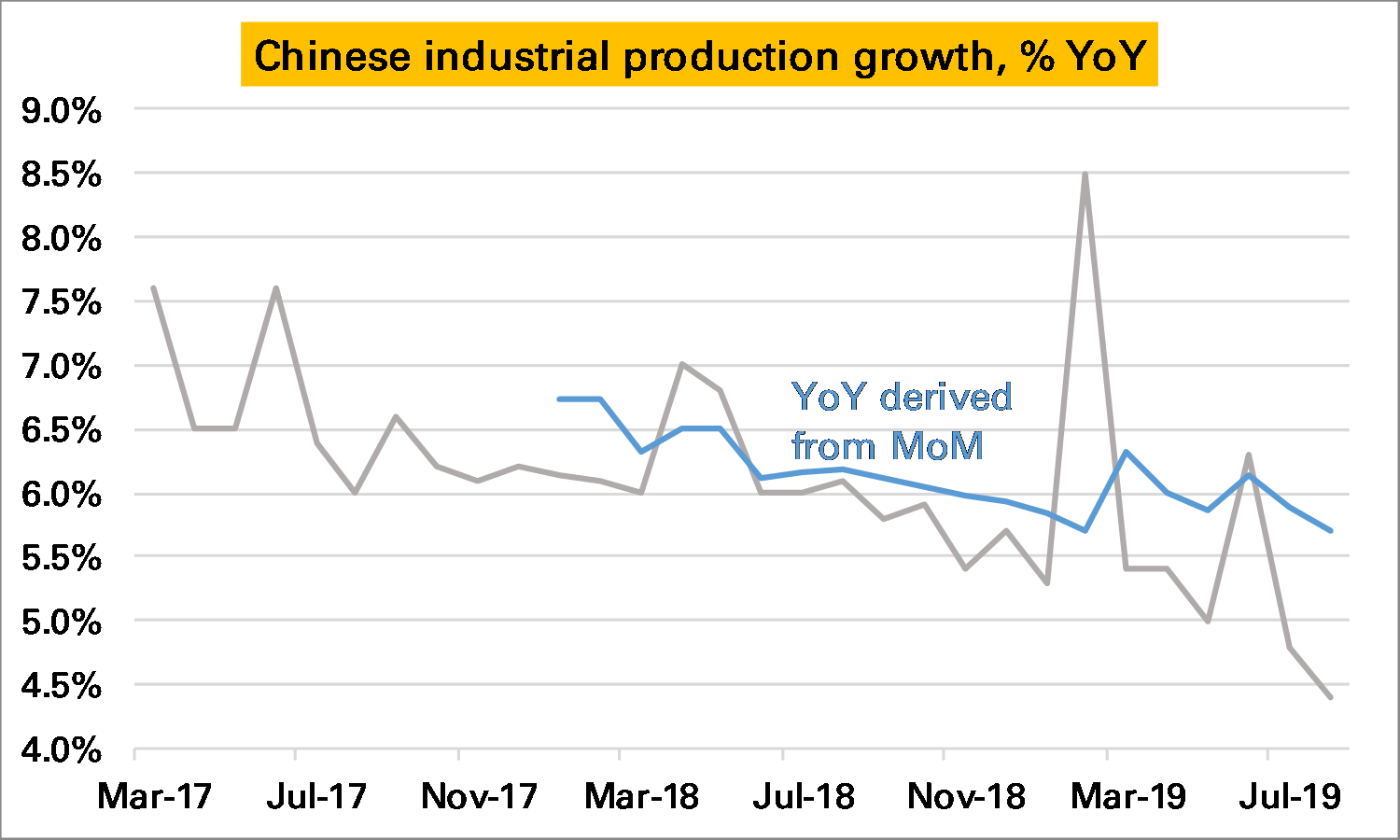
There lies one more complexity. The YoY rate derived from this monthly data does not equal the YoY rate reported by the NBS. The first chart shows the former in grey and the latter (headline) in blue. Even with the weak October monthly print the derived YoY remains above 5.5%.

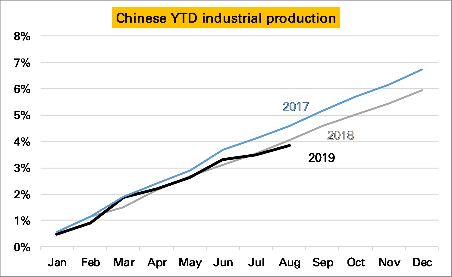
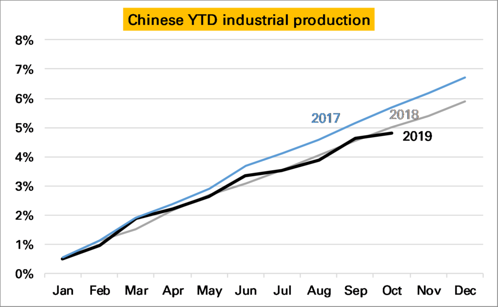
Where does that leave us? Chinese IP growth is slowing, though the YoY series might overstate the severity of the slowdown. October was a bad month, but November and December are likely to be better given the 2019 pattern so far. Given so much confusion I cling to my chart of YTD growth in industrial production derived from the monthly data. The pattern is less smooth this year but overall output has grown much the same as in 2018.

Notes:

  1. An obvious exception being shifting annual holidays such as Chinese New Year or sometimes Easter

Chinese industry recovers as expected

Last month I suggested that Chinese industry was not doing as badly as the August year-on-year (YoY) series suggested, a rise of just 4.4%. This was because the seasonally adjusted month-on-month (MoM) series, theoretically a much better guide, implied a higher YoY rate of 5.5%.

September’s data was released today and shows the YoY series rebounding more strongly than market expectations, now up 5.8% YoY.

In part this was because September saw a strong 0.72% MoM increase.

Source: NBS, Matthew Turner, October 2019

But it also looks like some catch-up with the implied YoY series.

Source: NBS, Matthew Turner, October 2019

Year-to-date (YTD) Chinese industry is actually slightly outperforming how it did in 2018 using this MoM data*.

* Of course one might not believe any of the data series.

IMF notices precious metals

In today’s latest World Economic Outlook (WEO) the IMF devotes a large-ish section to gold and other precious metals (p.47 onwards here).

Perhaps the most interesting section is on whether they serve as an inflation hedge. Finding a positive but weak correlation to inflation itself, the analysts also look at gold prices against modelled inflation risks. Here they are more positive, saying:

Results of the analysis support the view that precious metal prices react to inflation concerns… An increase in inflation uncertainty by one standard deviation tends, within a month, to raise the price of gold by 0.8 percent and silver by 1.6 percent. A decline in inflation uncertainty can explain half of the observed gold price decline of the 1990s and one-third of the price rise after 2008. The role of inflation uncertainty is, instead, positive but not significant for platinum and palladium, yet irrelevant for copper

For many gold’s main advantage is not inflation but against systemic risk. The IMF also looks at this through reactions to S&P 500 moves. This is something I have long done, and the IMF’s conclusions are the same – gold does act as a safe haven when the S&P 500 falls, silver does but less so, and the other metals do not. Here’s one of my versions of this table.

Finally the IMF also mentions precious metals’ sensitivity to dollar moves. But only to express surprise the beta can sometimes be more than 1 (ie if the dollar falls 1%, gold rises more than 1%). I think this relationship – which is partly obvious given we are quoting the price in dollars – needs more discussion and will do so in a later post.

Do Americans still work harder than Brits?

The advocacy of a four-day working week by the Labour Party’s shadow chancellor, John McDonnell prompted a commentator to say that the one bulwark against the Americanisation of the UK economy was that the British were a bunch of slackers, at least compared to the industrious Americans.

This got me thinking. We all know that Americans work longer hours – the OECD in 2018 puts the average working year at 1,768 hours, 15% higher than the British who put in 1,538 (incidentally about the same as in France; it’s Germany which has the really short hours at 1,363). This difference of 230 hours is about 5 hours extra per work, or the equivalent of about 7 weeks holiday untaken.

See here for chart.

However, fewer Americans now work at all compared to the British. The employment rate, which measures what proportion of people of working age population are in fact working, is just 71.1% in the US, compared to 75.1% in the UK.

See here for chart

If we multiply hours worked by % working we should get the average hours worked per person of working age population. For the US this is 1,768 x 71.1%, or 1,257 hours a year. For the UK it is 1,538 x 75.1%, or 1,155 hours. So the Americans still have it, but by a narrower amount of 9%.

It might even be closer than that. It is hard to be sure definitions are the same between the two countries. If we look at total hours worked in the economy, in 2018 it was 254.6bn in the US and 54.0bn (1,038*52) in the UK. The number of adults in each country is quite hard to find out, but seems to be 253m in the US, and 52.5m in UK. This suggests a very similar number of hours per person over the age of 18* of 1,028 in the US and 1,006 in the UK.

I’m not sure why this gives a more similar figure than the other method. The main difference is it includes pensioners, but this should boost the US total (there are fewer of them, but they work more than in the UK) So it might be due to differences in definitions around ages, or something to do with the military.

Either way the Americans do still work longer hours than the Brits. But there isn’t much in it.

How bad is German industry?

September’s flash German manufacturing PMI came in at 41.4, the weakest print in 123 months (that’s 10 years, 3 months, so back to the GFC).

The reason we pay attention to PMIs is that they are much more timely than official data. Today’s PMI is for September, the manufacturing output data it is meant to foreshadow is available only to July.

What it implies, therefore, is more weakness to come. The relationship of the PMI to actual manufacturing output is not hard and fast – but closest at the YoY level (somewhat of a puzzle, though perhaps that is how purchasing managers think). A print of 41.4 historically is consistent with a 10% YoY slump in output, but we can’t be confident in that given the limited number of datapoints available (for example in 2012 such a relationship would have been too pessimistic). A safer conclusion is that we are very unlikely to see any German output growth over this period.

Source: Markit

How bad is Chinese industry?

Chinese industrial production (IP) growth slowed in August to just 4.4% Year-on-Year (YoY), which is a 17-year low.

Source (this and all charts): National Bureau of Statistics

We need to keep in mind that this data is not seasonally adjusted and can show some wild swings. This is especially true in February and March, when the shifting dates of Chinese New Year have a large impact. Only five months ago in March 2019 IP growth was reported as up 8.5% YoY, clearly an aberration.

What we need is an estimate of the level of Chinese industrial production. But the National Bureau of Statistics (NBS) does not publish one.

What it does publish, however, is a seasonally adjusted month-on-month (MoM) growth rate. This too is rather odd, showing distinct seasonal patterns, but in 2019 has also been trending downwards. In August it was just 0.32% MoM, the slowest rate in the last three years and a mere 4% annualised.

The MoM series can be used to back out a level of IP, and from this an alternative YoY growth rate. It is noticeable this paints a less pessimistic picture than the official YoY series, showing in August a YoY rate of around 5.5%. But it is also true that this backed-out series has been higher than the official series for much of the last year, somewhat of a puzzle.

Interpreting Chinese data is never easy, even if you accept them at face value. From the NBS’s two series it seems safe to conclude IP growth is slowing, though perhaps not as severely as the YoY numbers suggest. On a YTD basis industry has expanded not much less than in 2018. But the last two months have been weak. September’s data will be interesting.