China’s gold imports slump

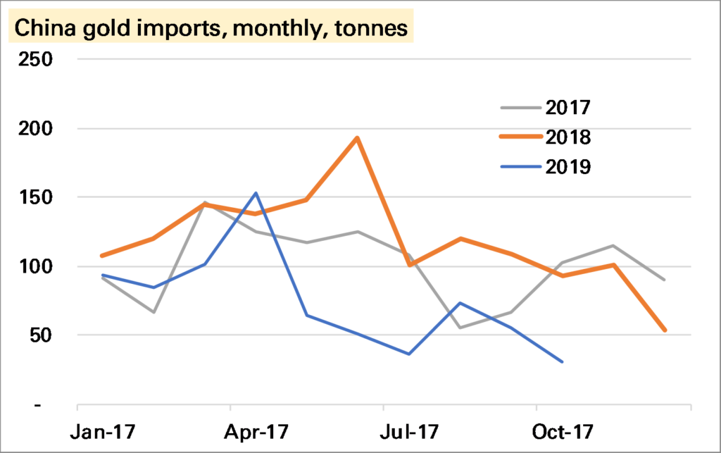
China imported just 35t of gold in October, the lowest monthly amount since it began reporting official trade data from January 2017. Seasonality must have played a role given holidays in October. But while the trajectory of imports looks a little similar to 2018, it is at a far lower level.

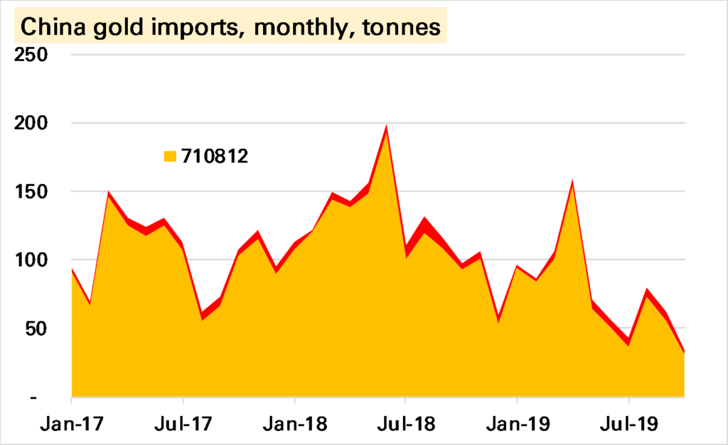
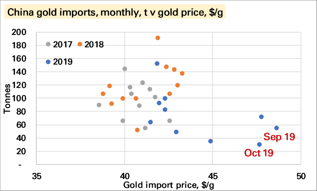
The high gold price is another factor. The first chart below shows that imports in the last two months have been made at by far the highest price in this data series, and arguably are not out of line with previous trends. In terms of the amount of money spent on imports the trend does not look as poor as for the volume (second chart below) though October was still a poor month.

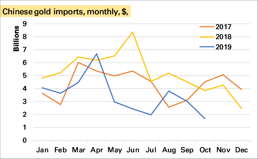
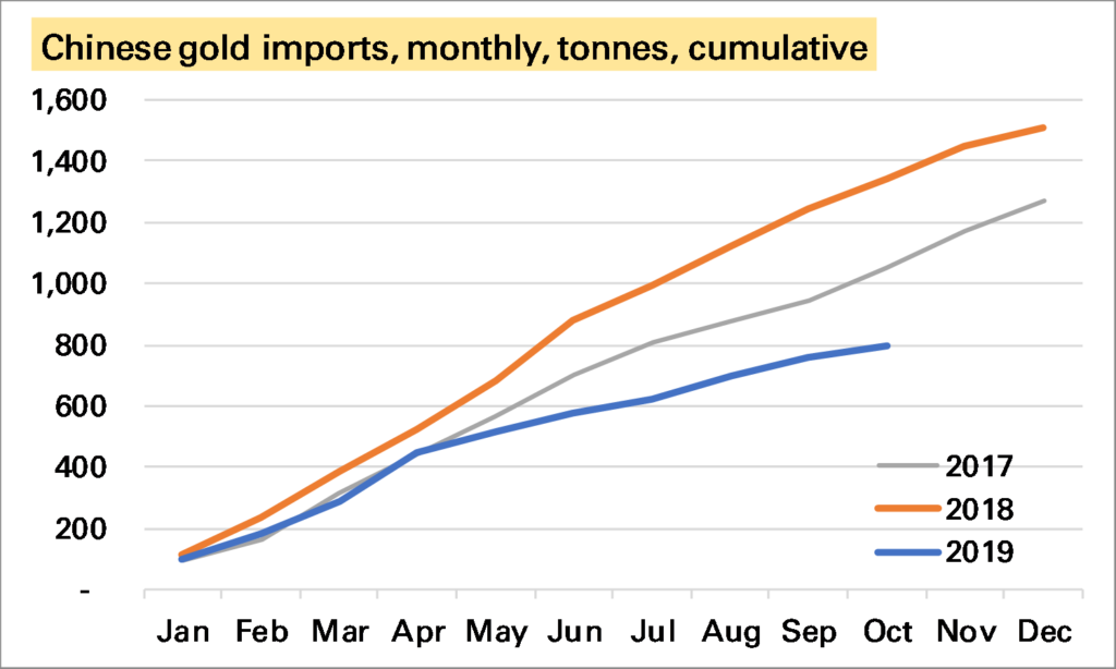
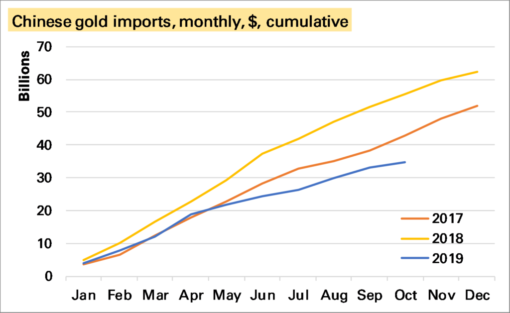
Year-to-date gold imports are now around 800t, well below the levels seen in the last two years. In terms of money spent the gap is narrower – and perhaps not too bad given the restrictions placed on imports earlier in the year – though again October does stand out as suggesting a worse trend.

Source: All charts – China Customs. Note click on chart to enlarge.

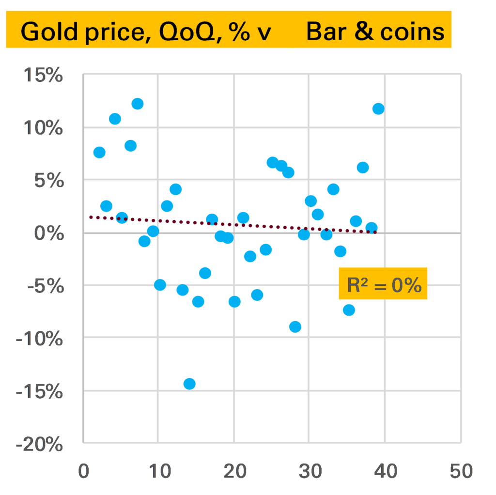
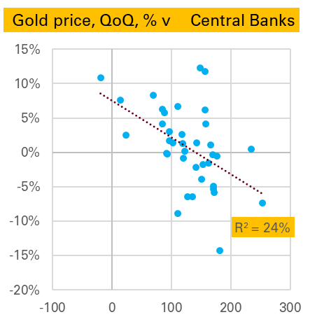
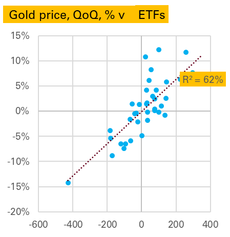
To what extent does this matter? It’s possible China is importing gold in other forms such as jewellery, or there are more unofficial imports going in. Even if not (Western) investors have been buying a lot of gold, and despite all the talk of gold stockpiles, this tends to mean the Chinese can’t have as much. The price rises to see who wants it most and typically it’s the investors.

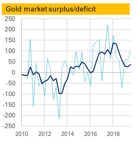
But… the biggest risk to the gold market medium-term, in my view, is lacklustre”physical” demand, of which over 50% comes from China and India. In particular it seems to me that gold – both as a consumer good and an investment good – now faces far more competitors (eg smartphones, index-linked bonds) than it once did. Of course some of its qualities are unique and it has a long track-record, suggesting a certain robustness.

That the dollar spend on Chinese gold imports is declining could be another warning sign.

For the background on how China now publishes gold trade data see my LBMA Alchemist piece from earlier this year.

Chinese industry – doing worse & better than the headlines say

I don’t like monthly YoY data. For sure it has its advantages, in particular seasonality is normally dealt with. 1 But as a guide to what happened in the month in question it it rather lacking.

Chinese industrial production, an important datapoint for commodity demand (and the wider global economy), is normally reported as a YoY series. This has slowed steadily, and in October was just 4.7% higher YoY, a sharp slowdown from the 5.8% growth seen in September (grey line in 1st chart). However it remained higher than the low of 4.4% seen in August.

The probem with a YoY series is we don’t know whether October was a bad month, or October 2018 was a very good month, and similarly how it compares to September.

Luckily for IP, China also publishes a seasonally adjusted month-on-month (MoM) series. It doesn’t get much attention but in theory should give us a much more accurate read on how the industrial sector is doing at the moment. If so it looks very bad news – October saw growth of just 0.17% a month. This is the lowest monthly print I can remember, and as the following chart shows certainly the lowest in the last three years. If maintained for the next 12 months Chinese YoY IP growth would be just 2%.

But the chart above also shows something else – the seasonally adjusted monthly growth rate appears rather…seasonal…especially in 2019. The first month of each quarter has been weak, and the last month strong. As such it looks like November’s print is likely to be around the same as in 2018 and December’s much stronger than in 2018. This would mean the YoY rate should stay around the same in November and rise strongly in December.

There lies one more complexity. The YoY rate derived from this monthly data does not equal the YoY rate reported by the NBS. The first chart shows the former in grey and the latter (headline) in blue. Even with the weak October monthly print the derived YoY remains above 5.5%.

Where does that leave us? Chinese IP growth is slowing, though the YoY series might overstate the severity of the slowdown. October was a bad month, but November and December are likely to be better given the 2019 pattern so far. Given so much confusion I cling to my chart of YTD growth in industrial production derived from the monthly data. The pattern is less smooth this year but overall output has grown much the same as in 2018.

Notes:

  1. An obvious exception being shifting annual holidays such as Chinese New Year or sometimes Easter

Global EV sales firmly in reverse

A slump in Chinese electric vehicle (EV) sales drove global EV sales into reverse in October. I estimate, using national and other sources, that 130k EVs were sold during the month (140k if you include Chinese commercial vehicles), 32% lower YoY, with both battery-electric vehicles (BEVs) and plug-in hybrids (PHEVs) down a similar amount.

The sharp global YoY fall is partly because in previous years sales have risen into year-end on a combination of beating expiring incentives and a generally rising market. But sales last month were also lower MoM, and while this owes something to wider market trends, it is mostly due to China.

In China, which accounted for 64% of global EV sales in October 2018, EV sales were 54% lower YoY, with BEVs down 47% and PHEVs down 78%. The following chart shows this is not primarily related to a weakening wider market (all passenger car sales were down, but a more modest 6%) but a sizeable fall in market share. The reasons for this we’ve discussed many times before, and are mostly subsidy-driven, though the extent of the slump does point to some consumer disenchantment. Sales for the full-year are now only 18% YoY higher YTD and could end the year lower than in 2018.

If we exclude China then global EV sales were still slightly higher YoY, though note not by much.

The only bright spot at present is Europe (see my earlier post), where sales were more than 50% higher YoY. And while total EV sales in Europe were still lower than China in October (48k to 56k) the gap has narrowed considerably, and in terms of market share of all car sales Europe has now been higher for two months. Of course this owes something to the Tesla Model 3 roll-out, which is likely to subside, but it does suggest the dominance of the Chinese market in sales is not as obvious as once seen (of course production & battery manufacturer are different questions).

I’ve not said much about the USA, and for two good reasons. One, sales seem subdued, with Tesla concentrating on foreign markets. Two, we are lacking accurate data. The sterling work done by sites such as www.insideevs.com and www.cleantechnica.com in assessing this continues, but a decision by most manufacturers to switch to quarterly data 1 means much monthly data is now guesswork, and for PHEVs I’ve had to make an extrapolation on previous trends. This won’t make a change to our global conclusions – the US does not have a big enough market – but it does mean we need to be cautious on assessing the micro-trends.

My view on the longer-term outlook remains the same. The current slump is a reminder that technological shifts are rarely smooth, and some of the reasons for it (subsidy-issues, consumer reluctance) also point to why EV roll-out will be slower than the more bullish predictions. But subsidies are not all one way – the German government recently announced more generous ones – and consumer reluctance will be overcome by a wider and better range of models. And 2020 still seems a crucial year for that.

Notes:

  1. There is no national or govt tabulation as in many other countries

Europe EV sales remain solid

Using national sources I estimate European EV sales were 56% higher YoY in October, with just under 50,000 sold, a market share of around 4%.

Sales were lower than in September, partly a result of the normal trend of European car sales (the UK’s biggest month is in September due to number plate changes) but also because much of the pent up demand for Tesla Model 3s has now been satisfied.

Indeed given this that sales did as well as they did was impressive and due to an unusually high number of PHEVs being sold (see charts 2 and 3), especially in Germany. I don’t have the model breakdown yet to see exactly why this happened. Normally in EVs big changes are subsidy related, but German subsidy changes came only recently and more likely it reflects German marques having released a lot of new PHEV models recently as they are seen as a good way to meet the WLTP test restrictions.

YTD new EV registrations are up 42%, almost spot on my rule-of-thumb growth forecast of 40%.

Substitution still missing in Macedonia

September’s Macedonian trade data is out, important for PGM market participants as it is the best way I can come up with to track whether super-expensive palladium is being substituted out of the diesel catalysts for cheaper platinum 1.

So far there has been no evidence of such substitution, indeed the palladium ratio of the two metals has actually trended higher through most of this year.

September was a little different. Imports of both metals plunged, but because palladium fell more sharply, the implied ratio did move in platinum’s favour, to 36% by weight, compared to 44% in August’s data.

Source: UN comtrade, Matthew Turner, November 2019

But it’s way too soon to read anything into this. 36% is actually the six-month average, and higher than seen in many months this year.

The sharp fall in imports of both metals is quite interesting. It seems unlikely there is going to be sharp fall in output so one suggestion that comes to mind is metal was being stockpiled ahead of potentially disruptive “no-deal” Brexit (the metal comes from the UK), though that is guesswork.

What is clear is the imported price of palladium is rising fast. In September it was $1,570/oz, the highest on record. That corresponds to the market price in the first part of the month – October’s was much higher.

Notes:

  1. For details of why this is the case, which in short because Macedonia’s main importer is a huge JM catalyst factory, see here

Brexit referendum drivers

Three years late but I did this chart for somewhere else so thought would be shame to waste it. It shows for all 533 English parliamentary constituencies Chris Hanretty’s estimated (in some cases actual) Leave % vote v their ranked Index of Multiple Deprivation (lower = more deprived).

There is relationship been deprivation ranking & tendency to vote leave, though it is quite weak.

The ranking was done because that is how the original chart, which was on electoral party allegiance was done. It is more illustrative to show IMD as a score. Now the relationship 1 looks a little better but statistically it is still weak. Not lest because Liverpool Walton, by far the most deprived constituency on the IMD, only just voted Leave.

One correction that one might want to make is to show London separately. I don’t really like doing this as I’ve never bought the idea that London is that different from the rest of England. However in this case there is good reason to do so. London constituencies look relatively bad on an IMD basis, mainly because most do have large pockets of deprivation, but also because crime is high, and housing provision is said 2 to be poor.

Once you separate London the correlation between Leave vote and IMD in the rest of England is stronger, though still not overwhelming.

Finally, it’s worth noting that this analysis does not tell us which voters in each constituency voted Leave or Remain.

Notes:

  1. Note Chris Hanretty’s estimates do use demographics within a region to help estimate vote share, though if this is a problem it would be too make the relationship look stronger
  2. I say that as I tend to think the location of a house is an important factor in its quality

The gold S&D

The World Gold Council released its 3Q demand and supply statistics today (from research group Metals Focus). The summary page does a good job in explaining their key findings.

One thing I always look out for is the S&D balance, and in particular the surplus/deficit. From late 2016 the gold market entered a period of very large surpluses – totalling 361t in 2016, 336t in 2017 and 229t in 2018.

It is not clear what this was. It was not ETF demand as that is included separately. It might be what it once would have been called – “western implied investment”. But it no longer correlated to Comex positions. More likely it was to do with China, which had imported more gold than it has apparently consumed in other forms. Whether it was investment, e..g by HNW individuals, or something else, perhaps leased gold, is still unknown. But it didn’t seem particularly bullish – in fact it felt more like a classic price-weighing surplus.

Towards the end of last year the surplus began to fall. The first chart shows both the quarterly surplus, in light blue, and the rolling 12m average, both in tonnes. A big quarterly deficit in 4Q 2018 reduced the average sharply and so far this year though it has totalled 217t, that is down from 300t in the first three quarters of 2018.

So should we be concerned that the defiict in the most recent quarter, 3Q 2019 was higher than 3Q 2017 (95t to 57t)? Probably not. After all the gold price has been strong, and as such the surplus seems more likely to reflect unidentified investment. As I noted before deficits can be bearish – the corollary is surpluses can be bullish.

That said, the 2nd chart, which shows the QoQ change in the gold price (edit – note this is logged change) v the surplus-deficit shows little clear relationship either way (though gold’s largest price fall, in 2Q 2013, did match up to its largest deficit).

A similar analysis can be done for the other line items in the S&D balance. Starting with supply, as might be expected there is no relationship between changes in the gold price and the level of mine production 1. But there is a stronger one between changes in the gold price and the level of scrap generation 2 .

On the demand side jewellery is very interesting, with a strong negative relationship. That is in a quarter when the gold price falls a lot, jewellery demand is high, and in a quarter when the gold price rises a lot jewellery demand is weak. The causation here seems obvious, from price to demand, as the other way around makes little sense. 3. To some extent this is driven by 2Q 2013 again, though it would be wrong to exclude this as that was exactly the kind of price-driven buying we are expecting, and anyway the relationship is nearly as good if we do exclude it.

Bar & coin demand surprisingly, shows very little relationship, either in levels (shown in chart) or changes.

Finally we end with two strong correlations. The first is puzzling. Apparently central banks like selling gold in quarters when the price has risen and like buying it when the price is falling. This suggests a certain savviness and speed not usually associated with the official sector, but might be explained by them targeting a fixed $ amount of gold. More research is needed – and indeed more quarters in which central banks are net sellers, with only one datapoint since 2010.

The next is more intuitive. ETF flows are much larger in quarters when the price is rising and lower when it is falling. Are investors trend followers? More likely they are price-setters, with large short-term physical flows driving the price in either direction.

Source: All charts World Gold Council, Gold Demand Trends (data from Metals Focus)

Notes:

  1. If you think it would be stronger against the change in mine production – it’s not
  2. Here though, and elsewhere, there is probably some modelling relationship being captured given the difficulty in directly measuring such flows
  3. Interestingly this correlation is strong, but not stronger, if we use the change in demand