October’s Macedonian PGM imports have been released. To recap, this is my go-to data on whether substitution of platinum for palladium is taking place in diesel catalysts (for more details see embedded post below) as Macedonia imports PGMs for only one reason – to go in diesel catalysts.
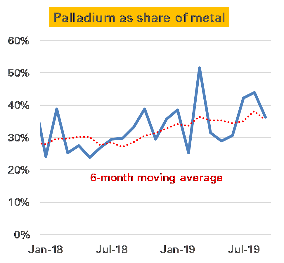
It was not a particularly exciting month. Both platinum and palladium imports picked up from a weak September, and the ratio of palladium was slightly lower than the recent average at 34%. Nevertheless as the second chart below show it would be a stretch to see this as any kind of price-related substitution.
There’s no doubt, by the way, that palladium is costing a lot. The import price of that metal averaged $1700/oz, a new record, and far more than the platinum cost of $890/oz. As such the dollar cost of the two metals’ import was much the same, despite the much larger volume of platinum.
For more details on this measure see these two previous posts.
It seems very important but analysts tend to ignore gold’s voluminous above-ground stocks. I’ve always thought this was a mistake, but I’m still not quite sure the best way to approach it. This is an idea I’ve had but it’s still very much a work-in-progress.
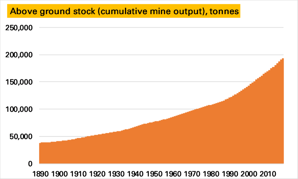
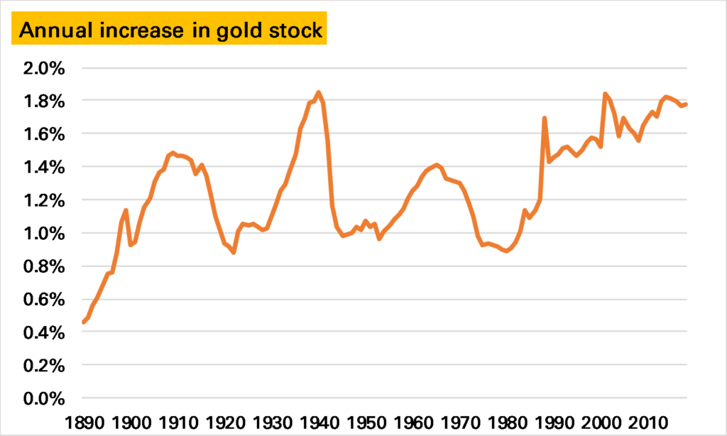
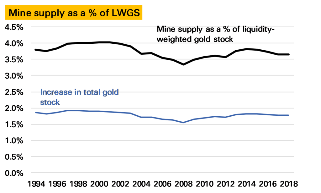
People throughout history have preferred to hold – store or wear – gold rather than consume it, and with very little deterioration very large stockpiles have steadily accumulated, rising by between 1-2% a year (see chart). GFMS 1, the research group, estimate this “above-ground stock” to be around 194,000t, some 55x annual mine supply 2.
This enormous stockpile gives (and is also a consequence of) gold’s financial-asset-like characteristics. But I’ve always thought something hasn’t quite added up about the “above-ground stocks” story. While the gold price is not very volatile compared to many other commodity prices, it seems to react far more to short-term shifts in supply & demand than you would expect of a true financial assetand given such a large inventory. To give an example, imagine all the world’s mines and wells are forced to shut 1/3rd of production for a year. The oil price would go stratospheric; gold would be far more restrained. But I think it would still go up more than a shortfall of 1,000t in a market of 194,000t would suggest 3.
How can we explain this?
One possibility is the stockpile is far smaller than most estimates. I think we can discount this. It is true the calculation is relatively unsophisticated, being essentially the sum of all historical mine production less a small assumption of gold lost forever. And it could overstate stocks if a) historical mine production has been overestimated, or b) losses have been understated, both perfectly plausible. But while over the years there have been lower calculations (see for example here), they are still many tens of times higher than current mine production; similarly even if GFMS’s ceiling of around 3,600t “unaccounted/lost” is too low 4, it is unlikely to be significantly too low.
Another explanation is that gold and gold investors are a special breed. This was suggested by Professor Anthony Neuberger in this 2001 WGC study.
Most private and institutional investors hold little or no gold. Investors who hold gold do so at least in part because gold has certain properties which make it peculiarly attractive in the event of acute political or financial instability. For these investors, gold is not readily substitutable by other assets.
In other words those who hold gold like gold as gold, not as just another financial asset, whereas most other investors don’t like gold as gold, and never the twain shall meet. Take, for example, a central bank. This argument says that hold gold as it is a unique asset of last resort, and so are unlikely to either sell it, even when the price goes a lot higher, or add more, even if it goes a lot lower. In general this means the effective potential ownership of gold is much smaller than for other financial assets, and as such the market is more internalised and hence susceptible to short-term flows.
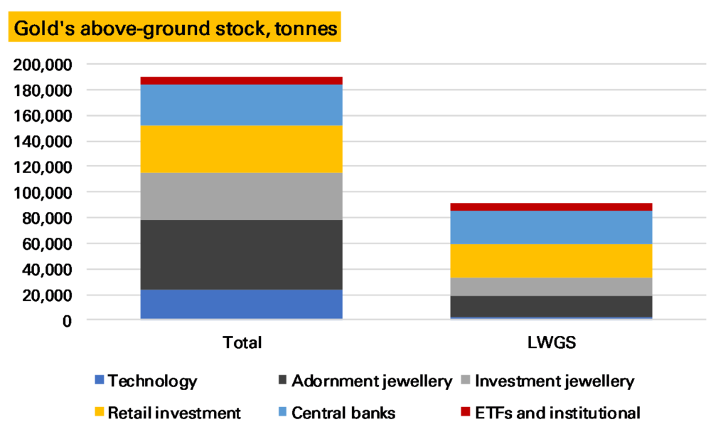
A third, and the one I want to explore, is related to both of these – that not all gold is the same. Of course we know it is held in different forms – of the 191,000t of stocks not lost or unaccounted for, GFMS estimate 5 91,600t is held as jewellery, 23,800t other fabricated products (but not coins) 6, 42,400t as private sector investment (ETFs, bars & coins) and 32,500t by central banks. My argument would be that some of this, such as ETF gold, is far more liquid than others, say certain jewellery or fabricated products and as such is likely to play a more important role in price formation.
One way to deal with this would be to exclude some of the stocks. Neil Meader, in a 2015 presentation, explored some of these issues here and offered a somewhat lower total. You could be more radical, for example, by look at the investment stocks (bars, coins and ETFs). This would reduce global above-ground stocks to 42,400t. If you added in central banks and OTC investment you would be nearer to 80,000t.
The risk here is in excluding too much. Jewellery does come back to the market and in response to price signals – especially high-carat jewellery in places like India. My alternative suggestion is that you weight each category of gold stocks in terms of how liquid they are. The idea would be that if, say, gold jewellery is being melted down and turned into bars, the global gold stock is becoming more liquid. If gold bars are being melted down and turned into jewellery, it is becoming more liquid.
Something similar happens to measures of the money supply, where the difficulty historically has been whether you should look at cash, or cash and current account, or those and savings accounts and so on (M0, M1 etc). The Divisia measure deals with this by aggregating them according to how much they provide transaction services, and its proxy for this is the relative interest rates on each type.
Unfortunately in gold we don’t have an interest rate to do that. And this is where it gets tricky. The question is how easily such gold can return to market. One measure could therefore be the cost of transforming the product into London Good Delivery metal. For ETFs this is almost zero. For bars and coins it is relatively small. For jewellery it is higher. But it doesn’t quite measure what we want. After all the cost of transforming low caratage western jewellery presumably isn’t much higher than high-carat jewellery, but it is less likely to happen as the western jewellery has higher value-added elsewhere. So possibly a better measure is gold as a % of the items value – near 100% for investment gold, quite low for western jewellery and industrial gold.
Calculating neither of these will be easy. And so I’m just going to give some guesses. I’m going to weight ETF and institutional gold holdings at 1, retail investment at 0.7, high-carat investment jewellery at 0.5, western-style jewellery at 0.3 (note I’ve made some assumptions about the split between these) and other fabricated products at 0.1. Central banks is a tricky one – they hold mostly London Good Delivery Gold, so highly liquid, but there is a lot institutional stasis preventing both buying and selling. I think the former wins out – so I’ll go for 0.8 – but I could see good reasons for a much lower figure.
Applying these weights to the current 191,000t of actual above-ground stocks gives a a weighted figure of 91,000t (which I’ll call, slightly inaccurately, the liquidity-weighted gold stock, LWGS), made up of 2,400t of other fabricated stocks, 16,500t of adornment jewellery, 14,700t of high carat investment jewellery, 25,400t of bars/coins, 26,000t of central bank gold and finally 6,100t of ETFs and other institutional stocks.
Does this aid analysis? Obviously it means for a given size of gold move the market will have a harder time absorbing it. New mine supply every year represents about 3-4% of this weighted gold stock compared to 1.5-2% of the total gold stock.
Of course while new mine supply needs to be absorbed, it is no longer an indication of how much the gold stock is growing by. That which is diverted into technological uses, for instance, doesn’t add at all much on my measure.
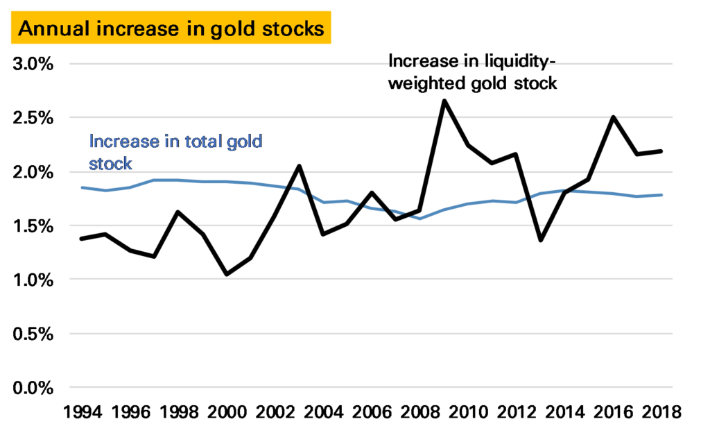
The annual increase in the liquidity-weighted gold stock looks like this.
We can see that in the 1990s the global LWGS grew less slowly than the total gold stock (or put another way the total gold stock was becoming less liquid), a function largely of liquid central bank gold being sold and converted into less liquid Asian jewellery. But starting in 2001, and gradually building up to 2009, the annual increase in this liquidity-weighted gold stock accelerated as this process reversed, with a splurge of investor buying. Since the the liquidity-weighted gold stock has continued to grow proportionally faster than the total gold stock, with the exception of 2013, when a wave of ETF selling saw liquid gold melted down and converted into less-liquid jewellery into China.
Notes:
Note all the charts in this piece are based on GFMS Refinitiv supply/demand data, with historical data from the USGS ↩
The only slightly comparable commodity would be silver – see here for a new look at its inventory ↩
A similar argument can be made if gold demand was to fall by 1,000t suddenly – in theory investors should rush in from other assets – in practice I think the price would fall substantially ↩
And it oddly hasn’t changed in nearly two decades, I think ↩
Compared to the total stock these breakdowns are evidently more open to error ↩
I’m a bit puzzled what this is, to be honest. The bulk of industrial demand is electronics, at around 300t a year, which would account for this but surely much of that is thrown away or recycled? ↩
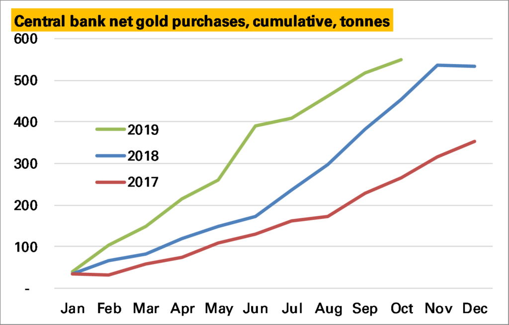
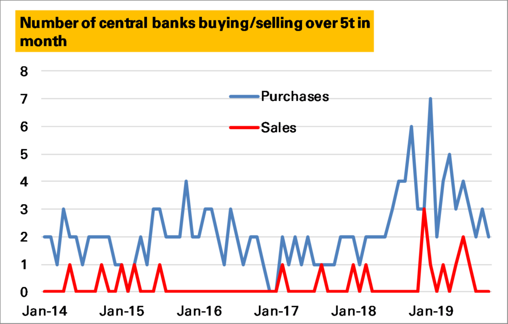
As of October, the latest available data for most countries, there has been a net addition of 550 tonnes to central bank reserves, 17t more than in the whole of 2018 and far ahead of the amount seen in 2017.
Purchases are slowing, however. By the end of the first half of 2019 net purchases had already reached 390t, an average of 65t/month. In the last four months 160t have been purchased, a slower 40t/month. This figure might rise a little – some countries report late, and the trend tends to be higher – but is unlikely to change much.
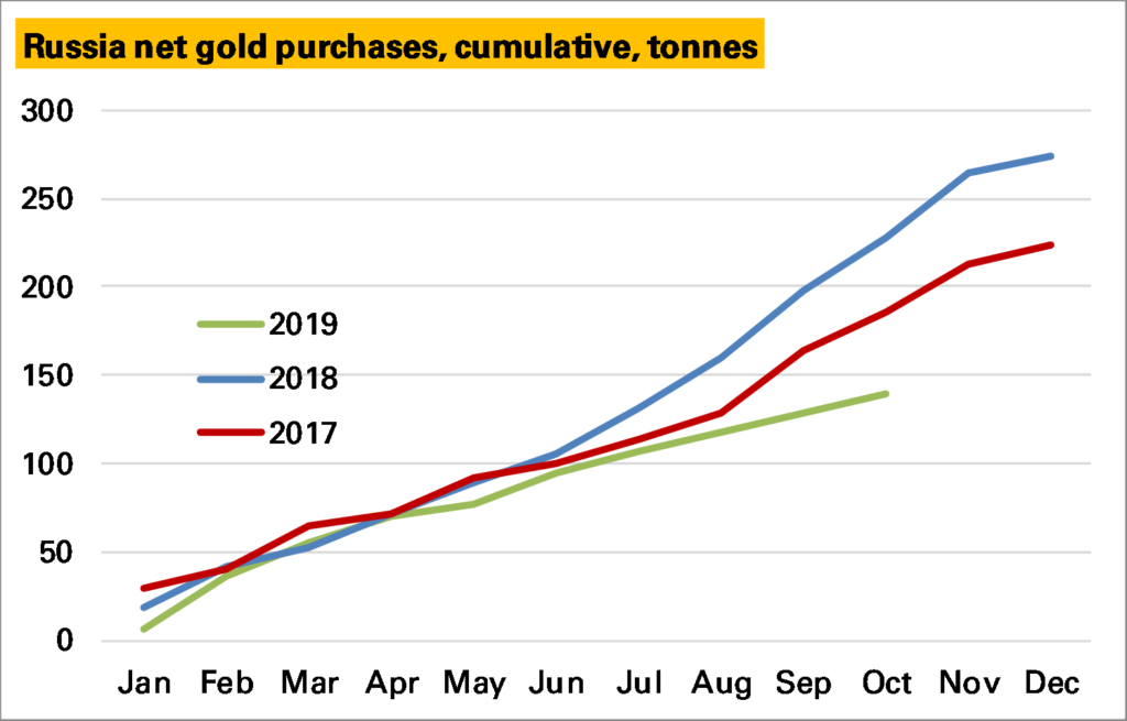
To what extent is this a concern? A key reason for the H2 slowdown is Russia, the bedrock of global central bank gold accumulation. Here purchases in 1H were broadly inline with previous years, but since then have been much more muted. This is in line with a new policy adopted by the Central Bank of Russia to reduce gold accumulation and has meant an increased rate of Russian gold exports. As such it looks set to be a drag on the global total going forward, albeit one that was inevitable at some point.
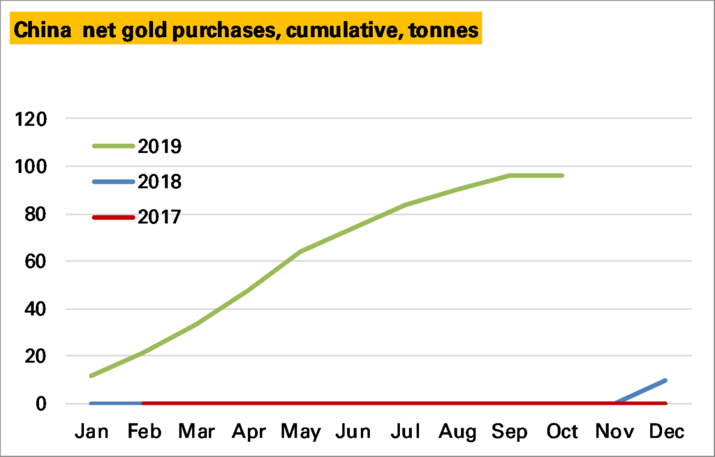
Also helping purchases in 1H 2019 was a resumption in Chinese central bank gold buying after a few years hiatus. This too seems to have slowed a bit in 2H but it is too soon to know whether October’s zero purchases marks another cessation of buying or is a temporary pause.
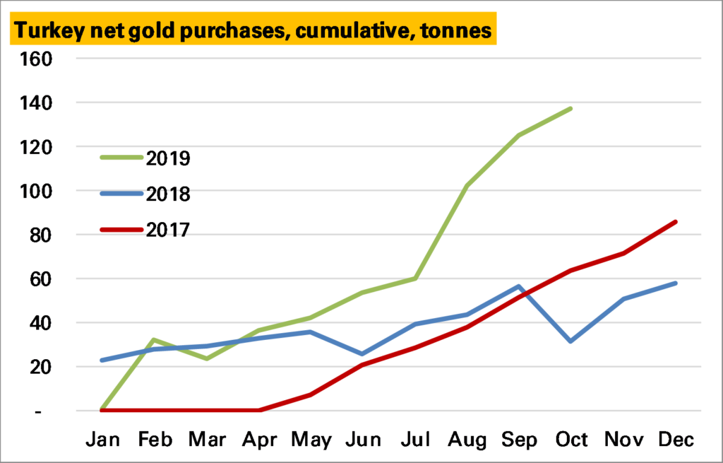
What has prevented an even more rapid slowdown, however, has been an acceleration in purchases from Turkey – on nearly 140t YTD, far higher than in previous years. Whether this will continue is a difficult one to call. Turkey’s central bank gold policy is somewhat confusing given they also hold private-sector gold against reserve requirements (these numbers exclude that), but there has been a policy shift in favour of gold in recent years.
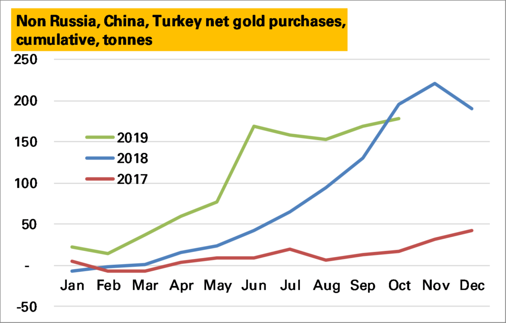
Finally, there is the Rest. And in recent years these have been the great hope of the gold market with a number of big purchases, particular in Europe from Hungary and most impressively Poland. In 1H 2019 other countries added 160t of gold, far more than ever before. In 2H so far barely 10t have been added. However the nature of these purchases mean that they tend to be lumpy.
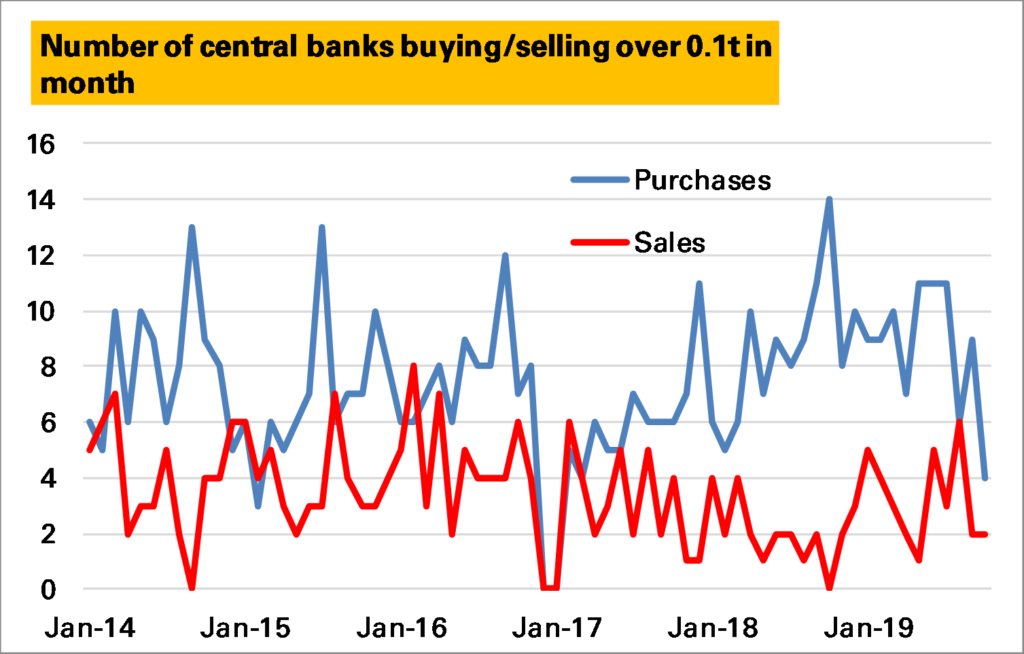
Indeed if we look at central bank activity, here shown as the number of central banks buying or selling in a month, we see an increase through 2018 in purchases, and a decline in sales, which has since reversed (note I’m excluding the BIS here, correctly, and Turkey, incorrectly, which in most months would add 1 to the purchases line).
If we choose a less granular measure, say 5t/month, the trend is even clearer (note exceptions above).
Source (all charts) – IMF and national central bank websites
So it does look as if there has been a slowdown in central bank buying, and not just because of Russia, which is the biggest impact. One explanation could be the high price, which might make the case for switching into gold harder to explain. But its worth remembering that the pace of buying in 1H 2019 was unprecedented, and current rates are still quite positive. The main concern I have is that Turkey is unlikely to be as reliable a buyer as Russia.
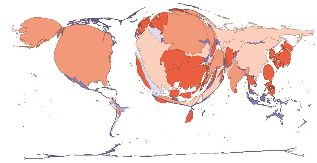
Over time this remains a positive part of the market, and I expect central bank purchases to continue, not least because of the imbalance in global holdings shown here (each country is resized to reflect the size of its gold holdings). For more details see here.
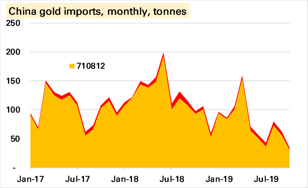
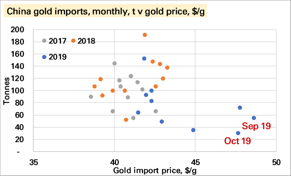
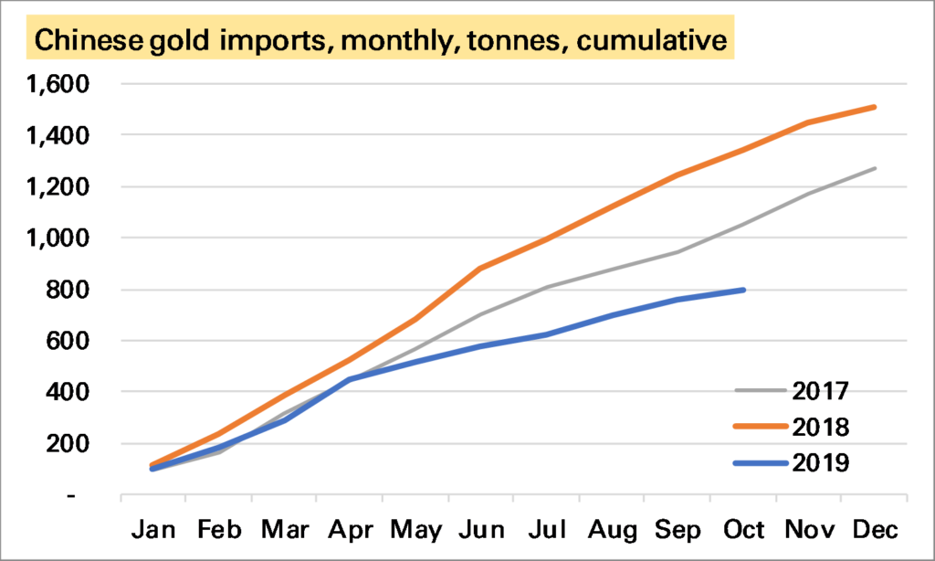
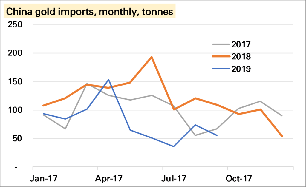
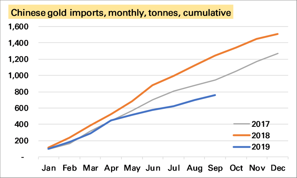
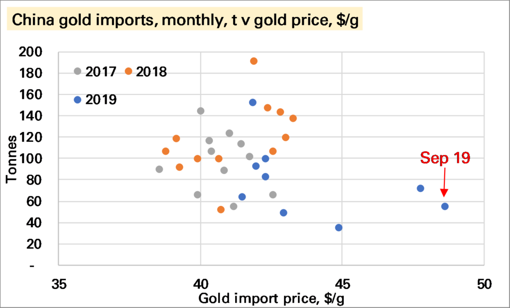
China imported just 35t of gold in October, the lowest monthly amount since it began reporting official trade data from January 2017. Seasonality must have played a role given holidays in October. But while the trajectory of imports looks a little similar to 2018, it is at a far lower level.
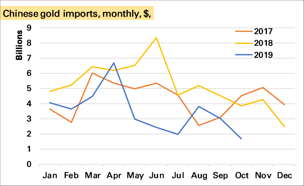
The high gold price is another factor. The first chart below shows that imports in the last two months have been made at by far the highest price in this data series, and arguably are not out of line with previous trends. In terms of the amount of money spent on imports the trend does not look as poor as for the volume (second chart below) though October was still a poor month.
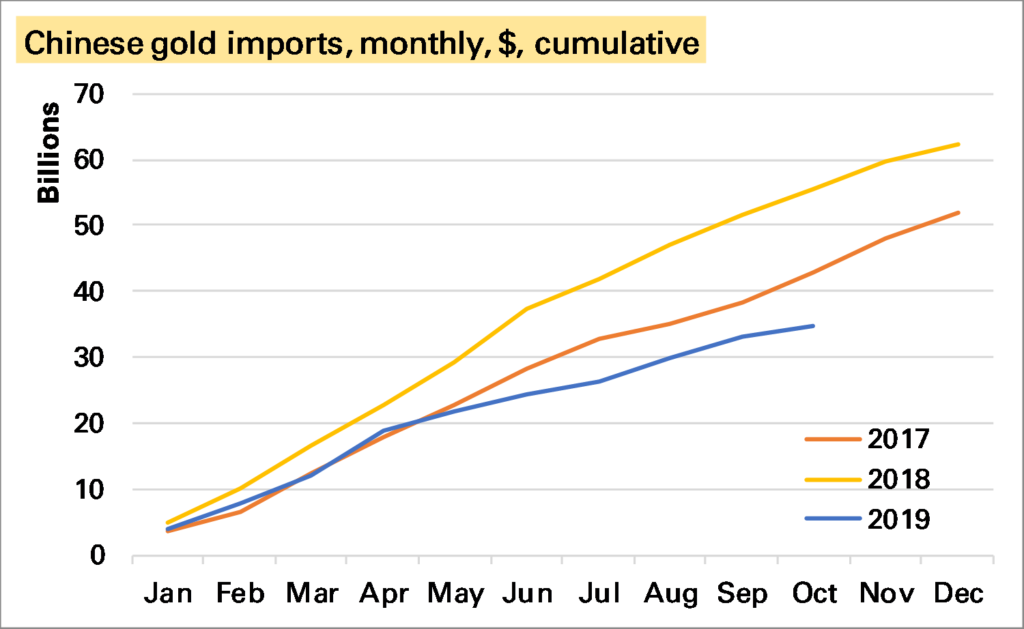
Year-to-date gold imports are now around 800t, well below the levels seen in the last two years. In terms of money spent the gap is narrower – and perhaps not too bad given the restrictions placed on imports earlier in the year – though again October does stand out as suggesting a worse trend.
Source: All charts – China Customs. Note click on chart to enlarge.
To what extent does this matter? It’s possible China is importing gold in other forms such as jewellery, or there are more unofficial imports going in. Even if not (Western) investors have been buying a lot of gold, and despite all the talk of gold stockpiles, this tends to mean the Chinese can’t have as much. The price rises to see who wants it most and typically it’s the investors.
But… the biggest risk to the gold market medium-term, in my view, is lacklustre”physical” demand, of which over 50% comes from China and India. In particular it seems to me that gold – both as a consumer good and an investment good – now faces far more competitors (eg smartphones, index-linked bonds) than it once did. Of course some of its qualities are unique and it has a long track-record, suggesting a certain robustness.
That the dollar spend on Chinese gold imports is declining could be another warning sign.
For the background on how China now publishes gold trade data see my LBMA Alchemist piece from earlier this year.
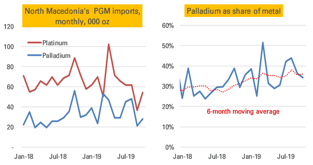
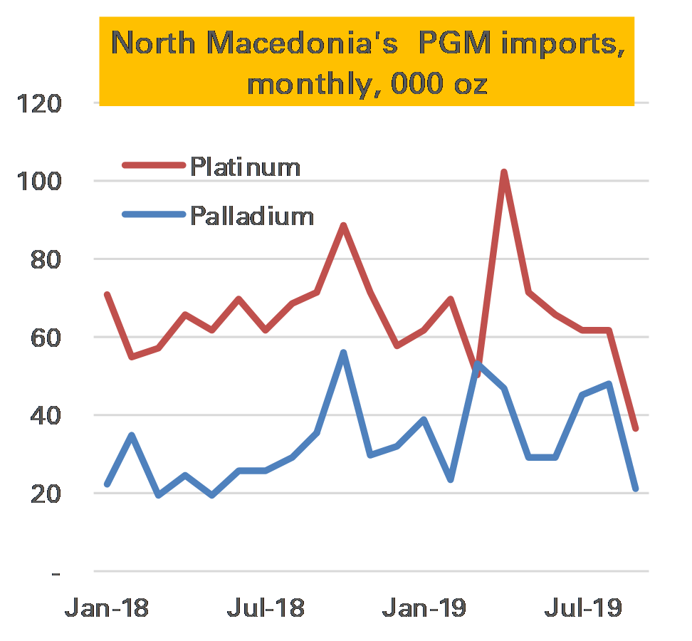
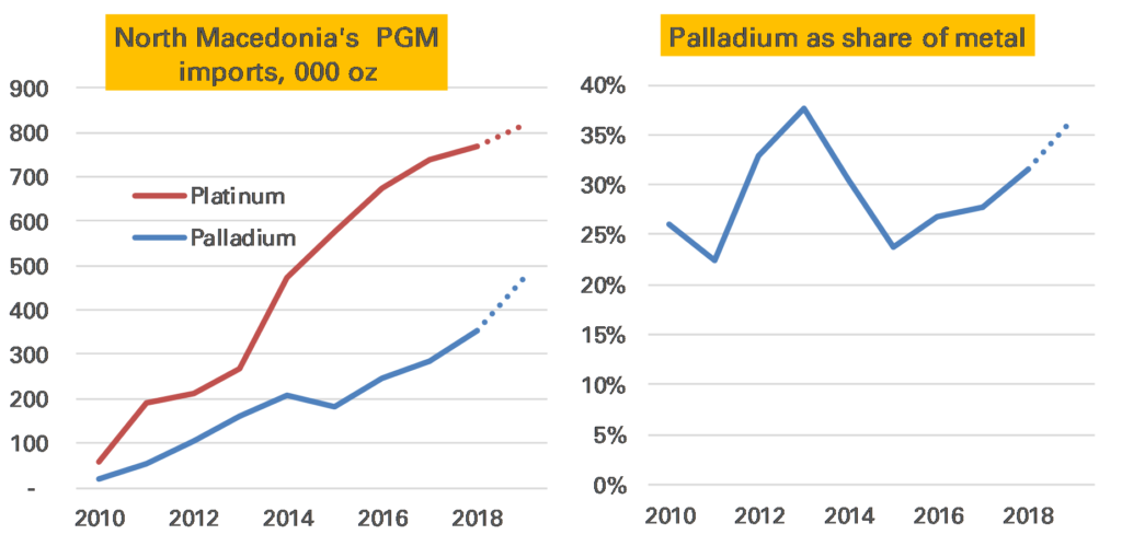
September’s Macedonian trade data is out, important for PGM market participants as it is the best way I can come up with to track whether super-expensive palladium is being substituted out of the diesel catalysts for cheaper platinum 1.
So far there has been no evidence of such substitution, indeed the palladium ratio of the two metals has actually trended higher through most of this year.
September was a little different. Imports of both metals plunged, but because palladium fell more sharply, the implied ratio did move in platinum’s favour, to 36% by weight, compared to 44% in August’s data.
Source: UN comtrade, Matthew Turner, November 2019
But it’s way too soon to read anything into this. 36% is actually the six-month average, and higher than seen in many months this year.
The sharp fall in imports of both metals is quite interesting. It seems unlikely there is going to be sharp fall in output so one suggestion that comes to mind is metal was being stockpiled ahead of potentially disruptive “no-deal” Brexit (the metal comes from the UK), though that is guesswork.
What is clear is the imported price of palladium is rising fast. In September it was $1,570/oz, the highest on record. That corresponds to the market price in the first part of the month – October’s was much higher.
Notes:
For details of why this is the case, which in short because Macedonia’s main importer is a huge JM catalyst factory, see here↩
The World Gold Council released its 3Q demand and supply statistics today (from research group Metals Focus). The summary page does a good job in explaining their key findings.
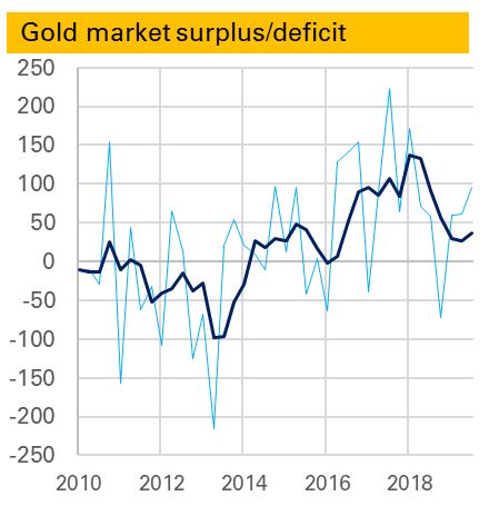
One thing I always look out for is the S&D balance, and in particular the surplus/deficit. From late 2016 the gold market entered a period of very large surpluses – totalling 361t in 2016, 336t in 2017 and 229t in 2018.
It is not clear what this was. It was not ETF demand as that is included separately. It might be what it once would have been called – “western implied investment”. But it no longer correlated to Comex positions. More likely it was to do with China, which had imported more gold than it has apparently consumed in other forms. Whether it was investment, e..g by HNW individuals, or something else, perhaps leased gold, is still unknown. But it didn’t seem particularly bullish – in fact it felt more like a classic price-weighing surplus.
Towards the end of last year the surplus began to fall. The first chart shows both the quarterly surplus, in light blue, and the rolling 12m average, both in tonnes. A big quarterly deficit in 4Q 2018 reduced the average sharply and so far this year though it has totalled 217t, that is down from 300t in the first three quarters of 2018.
So should we be concerned that the defiict in the most recent quarter, 3Q 2019 was higher than 3Q 2017 (95t to 57t)? Probably not. After all the gold price has been strong, and as such the surplus seems more likely to reflect unidentified investment. As I noted before deficits can be bearish – the corollary is surpluses can be bullish.
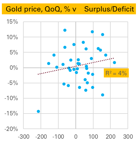
That said, the 2nd chart, which shows the QoQ change in the gold price (edit – note this is logged change) v the surplus-deficit shows little clear relationship either way (though gold’s largest price fall, in 2Q 2013, did match up to its largest deficit).
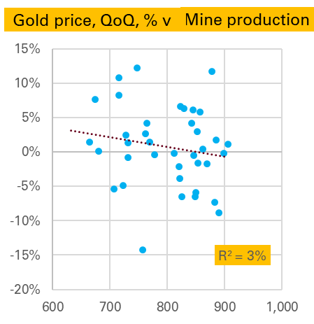
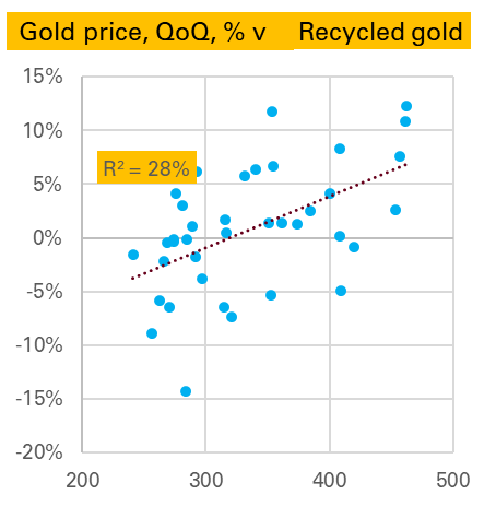
A similar analysis can be done for the other line items in the S&D balance. Starting with supply, as might be expected there is no relationship between changes in the gold price and the level of mine production1. But there is a stronger one between changes in the gold price and the level of scrap generation2 .
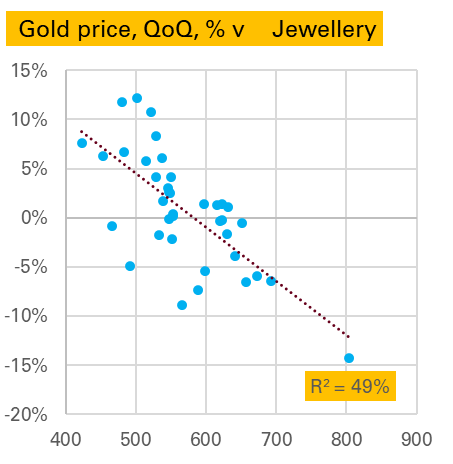
On the demand side jewellery is very interesting, with a strong negative relationship. That is in a quarter when the gold price falls a lot, jewellery demand is high, and in a quarter when the gold price rises a lot jewellery demand is weak. The causation here seems obvious, from price to demand, as the other way around makes little sense. 3. To some extent this is driven by 2Q 2013 again, though it would be wrong to exclude this as that was exactly the kind of price-driven buying we are expecting, and anyway the relationship is nearly as good if we do exclude it.
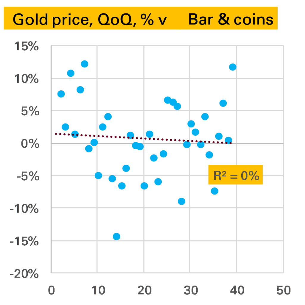
Bar & coin demand surprisingly, shows very little relationship, either in levels (shown in chart) or changes.
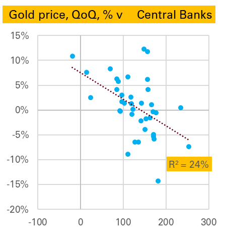
Finally we end with two strong correlations. The first is puzzling. Apparently central banks like selling gold in quarters when the price has risen and like buying it when the price is falling. This suggests a certain savviness and speed not usually associated with the official sector, but might be explained by them targeting a fixed $ amount of gold. More research is needed – and indeed more quarters in which central banks are net sellers, with only one datapoint since 2010.
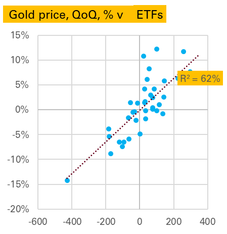
The next is more intuitive. ETF flows are much larger in quarters when the price is rising and lower when it is falling. Are investors trend followers? More likely they are price-setters, with large short-term physical flows driving the price in either direction.
Source: All charts World Gold Council, Gold Demand Trends (data from Metals Focus)
Notes:
If you think it would be stronger against the change in mine production – it’s not ↩
Here though, and elsewhere, there is probably some modelling relationship being captured given the difficulty in directly measuring such flows ↩
Interestingly this correlation is strong, but not stronger, if we use the change in demand ↩
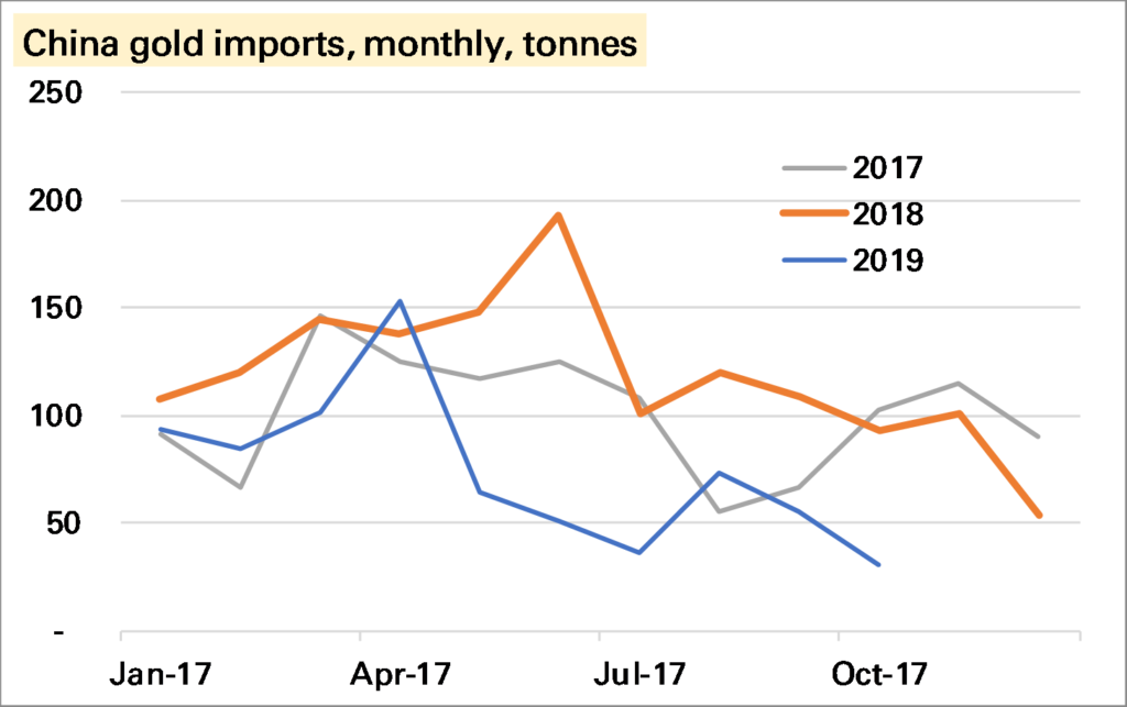
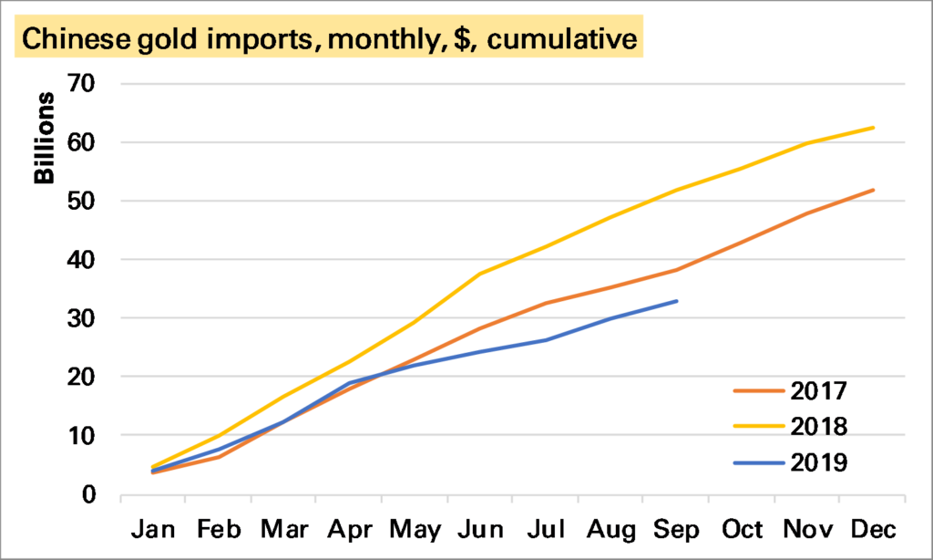
China imported 62t of gold in September, according to recently released customs data. This is slightly down on last month, above the lows of summer, but subdued compared to earlier in the year and in 2018.
Source (this and all other charts): China Customs, SGE, Matthew Turner, October 2019
Gold imports in the first nine months of the year have totalled 760t, more than a third lower than the 1,242t seen at the same point of 2018.
Of course one factor is the much higher gold price, with western ETF investors bidding up the price.
But in terms of value of gold imported 2019 is also proving a weaker year than 2018, and even, since the start of summer, with 2017.
Is this something for the bulls to worry about? This Reuters story placed the blame for the very weak summer period on quotas restrictions aimed at restricting the outflow of Yuan. These were apparently eased in August, helping explain why imports have picked up a bit. Presumably at the LBMA conference in Shenzhen more was said about this. Such restrictions do suppress gold demand but if only temporary are unlikely to do lasting damage.
Furthermore there is a real sense, despite all the talk of gold being a 200,000t “stock” market, that if ETF investors are buying a lot of gold, the Chinese can’t have as much. The price rises to see who wants it most. So it’s certainly not as concerning as it looks.
Nevertheless it remains concerning. The biggest risk to the gold market medium-term, in my view, is lacklustre”physical” demand, of which over 50% comes from China and India. In particular it seems to me that gold – both as a consumer good and an investment good – now faces far more competitors (eg smartphones, index-linked bonds) than it once did. Of course some of its qualities are unique and it has a long track-record, suggesting a certain robustness. But it pays to not be complacent.
For the background on how China now publishes gold trade data see my LBMA Alchemist piece from earlier this year.
Answer: it wasn’t and that was a good reason to think the price of palladium could go higher. And indeed it has gone higher, now nearing $1,800/oz.
We now have North Macedonia trade data for August. Does this show any shift towards platinum? Nope. Palladium was 44% of the palladium & platinum imported, higher than the YTD average of 36%. This reinforces the point that 2019 is on course to see palladium’s share rise not fall.
In today’s latest World Economic Outlook (WEO) the IMF devotes a large-ish section to gold and other precious metals (p.47 onwards here).
Perhaps the most interesting section is on whether they serve as an inflation hedge. Finding a positive but weak correlation to inflation itself, the analysts also look at gold prices against modelled inflation risks. Here they are more positive, saying:
Results of the analysis support the view that precious metal prices react to inflation concerns… An increase in inflation uncertainty by one standard deviation tends, within a month, to raise the price of gold by 0.8 percent and silver by 1.6 percent. A decline in inflation uncertainty can explain half of the observed gold price decline of the 1990s and one-third of the price rise after 2008. The role of inflation uncertainty is, instead, positive but not significant for platinum and palladium, yet irrelevant for copper
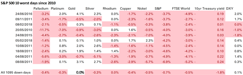
For many gold’s main advantage is not inflation but against systemic risk. The IMF also looks at this through reactions to S&P 500 moves. This is something I have long done, and the IMF’s conclusions are the same – gold does act as a safe haven when the S&P 500 falls, silver does but less so, and the other metals do not. Here’s one of my versions of this table.
Finally the IMF also mentions precious metals’ sensitivity to dollar moves. But only to express surprise the beta can sometimes be more than 1 (ie if the dollar falls 1%, gold rises more than 1%). I think this relationship – which is partly obvious given we are quoting the price in dollars – needs more discussion and will do so in a later post.
In commodity markets it seems widely accepted that market deficits are price bullish and market surpluses price bearish. Intuitively this feels right. A deficit is when demand is higher than supply and inventories (stocks) are falling. Such a situation cannot go on forever, as stocks are not infinite. Ultimately demand has to fall or supply has to rise, and in the absence of other factors (recession, technology etc) the way this happens is via a rising commodity price.
In practice it is not so clear cut, and the easier it is to hoard the commodity, the less clear cut it gets. For metals, and particularly precious metals, where hoarding is not only easy but often desirable, the picture is very muddy indeed.
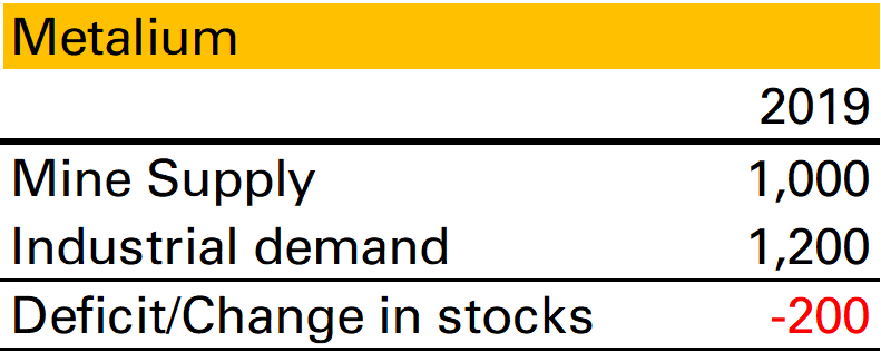
Take this S&D for Metalium, a made-up industrial metal. In 2019 1,000 units were supplied by mines, 1,200 were demanded by industry. This makes a deficit of 200, or put another way, a fall in stocks of 200. If I asked you what happened to the price in 2019 you would probably assume it moved higher.
Bullish? Bearish?
But what if I then told you that actually what happened was industrial users midway through 2019 saw that 2020 was set to be a very bad year for demand and decided to reduce their stocks by 200?
This now seems bearish! Most likely those 200 units flooded the market, pushed the price lower, boosting industrial demand and reduced mine supply.
In other words whether a deficit is bullish or bearish can depend on the reason stocks are falling.
In base metals, where stocks are mostly held within industry and are relatively stable, this latter scenario might not be that common. But in precious metals it happens all the time, as the stockholders are not industrialists but investors. If in an otherwise balanced market a very large investor decides the future of platinum is bleak and sells their holdings of 1 Moz, the market will be in a 1 Moz deficit but the platinum price will be a lot lower.
So on a static snapshot, market deficits are not necessarily bullish. But maybe we can at least say that they imply a higher future price? After all as we noted at the beginning of this piece, stocks are not infinite. A deficit might reflect a bearish investor throwing in the towel, but they can’t keep throwing in the towel. Ultimately there will come a point when there are no more stocks (or no-one wants to sell their stocks) and the commodity price will have to rise to bring supply and demand back in line.
This is more justifiable, though still not always true. Consider these two scenarios:
The industrialists or investors are right in their pessimism, and so a deficit in one year is followed by weaker demand or higher supply in the following year. In this scenario prices don’t have to adjust upwards.
The sale of stock is, in itself, new information that changes perceptions. An example would be if a European central bank announced, out of the blue, it had plans to sell gold.
Finally, for gold, where almost all demand is stockbuilding (by investors, but also by people in the form of jewellery) deficits and surpluses are even less well defined. I’ll have more to say about that in another post.