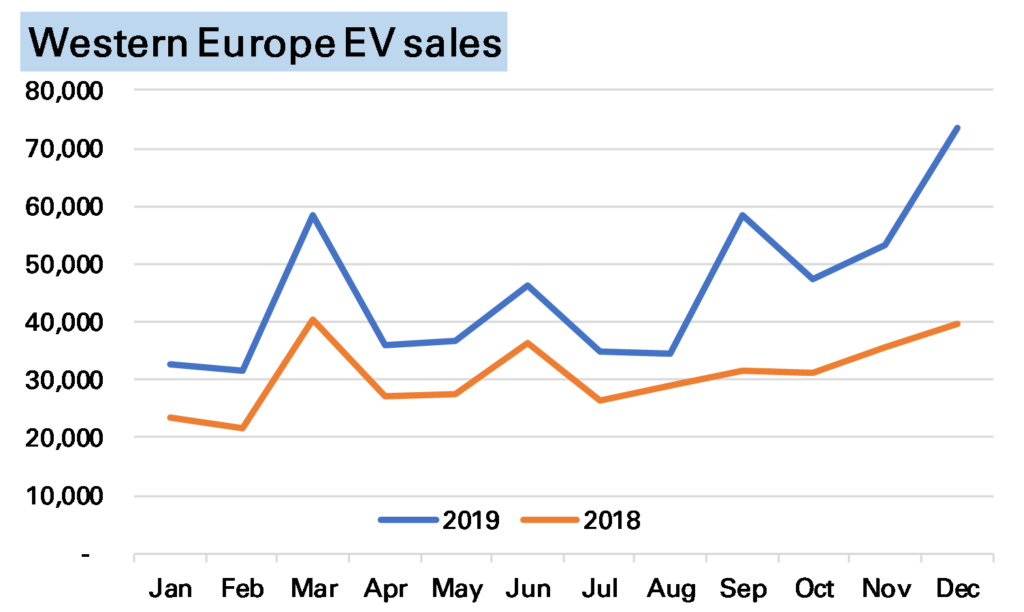
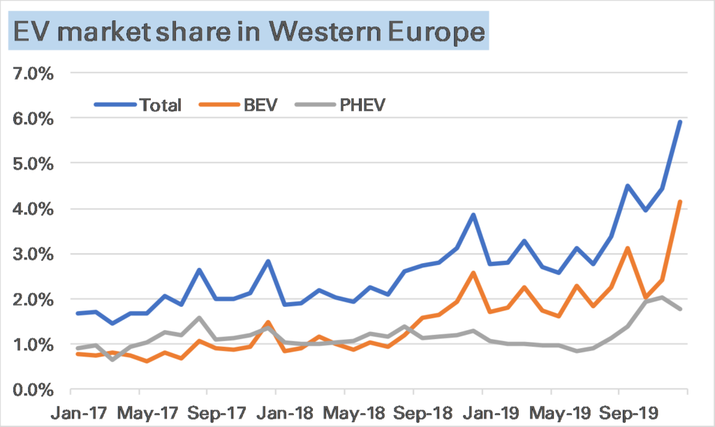
European electric car sales in December set a new record, at an estimated 74k units, a huge 85% higher than in December 2018. Market share, as shown in the 2nd chart, was nearly 6%, primarily made up of pure battery-electric vehicle (BEVs), up 94% YoY, while plug-in hybrids (PHEVs) were up 68% YoY but slightly down on November’s level.
Source (this and other charts): European national car associations.
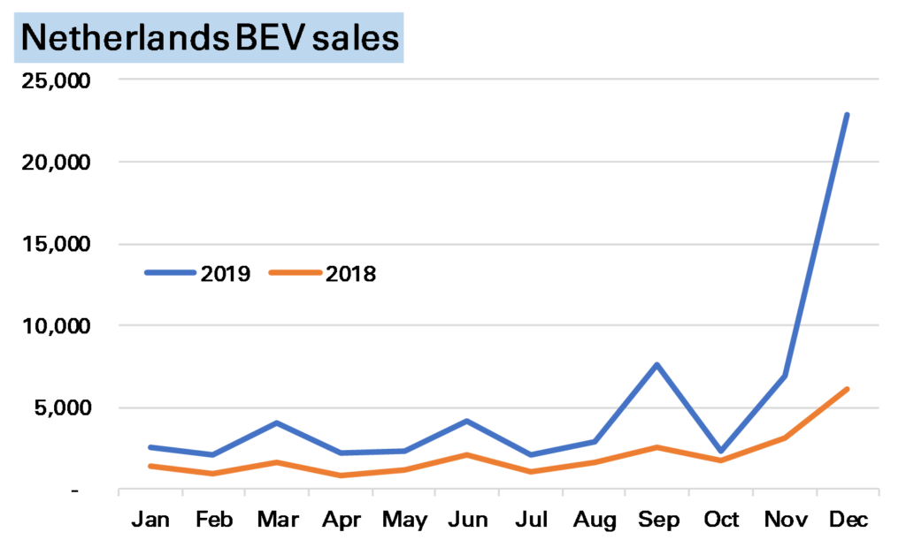
While European EV sales have been strong all year, December’s surge is somewhat misleading as to the underlying strength of the market. End-year can often see odd movements in EV sales as the market remains dominated by subsidies which often expire at that time. The most notable example this month was in the Netherlands, where higher taxes in 2020 brought forward purchases, seeing EVs take more than 50% market share and BEVs on their own sell nearly 25,000 units, a third of the European market.
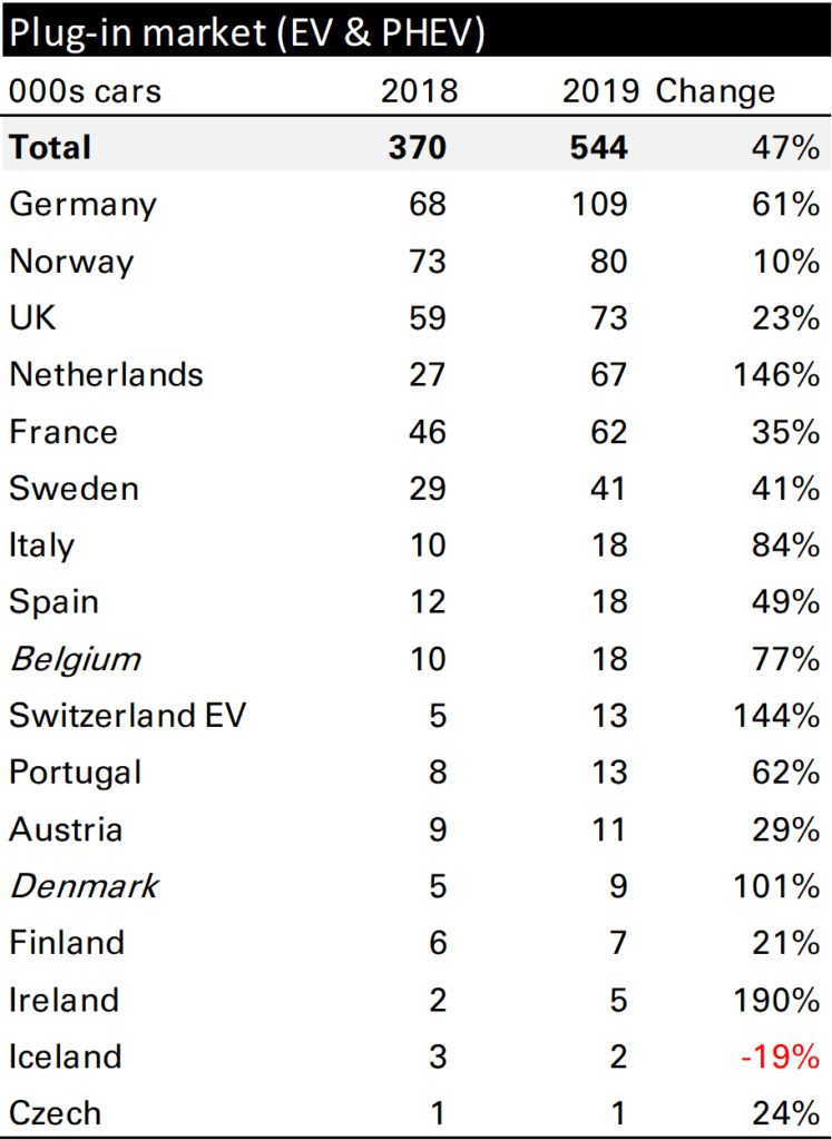
Without the Netherlands European EV sales in December would have been up less than 40%, the level which has been my base case for annual growth for a while. For the year as a whole European EV sales grew 47% (of course helped by that Netherlands surge) to 544k vehicles, a market share of 3.5%, from 370k vehicles, and 2.4% in 2018. Most markets were strong, but of the larger ones Germany stands out, up 61%. It’s also worth noting that BEVs massively outperformed PHEVs, gaining 80% to the latter’s 10%.
I don’t like monthly YoY data. For sure it has its advantages, in particular seasonality is normally dealt with. 1 But as a guide to what happened in the month in question it it rather lacking.
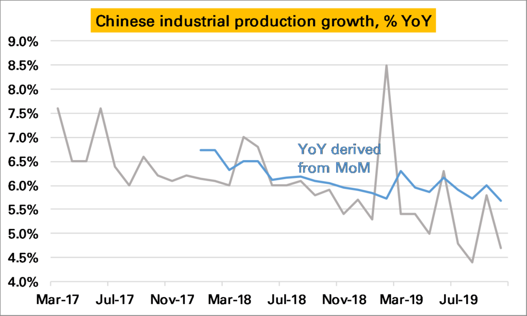
Chinese industrial production, an important datapoint for commodity demand (and the wider global economy), is normally reported as a YoY series. This has slowed steadily, and in October was just 4.7% higher YoY, a sharp slowdown from the 5.8% growth seen in September (grey line in 1st chart). However it remained higher than the low of 4.4% seen in August.
The probem with a YoY series is we don’t know whether October was a bad month, or October 2018 was a very good month, and similarly how it compares to September.
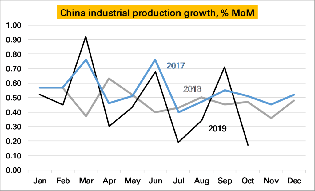
Luckily for IP, China also publishes a seasonally adjusted month-on-month (MoM) series. It doesn’t get much attention but in theory should give us a much more accurate read on how the industrial sector is doing at the moment. If so it looks very bad news – October saw growth of just 0.17% a month. This is the lowest monthly print I can remember, and as the following chart shows certainly the lowest in the last three years. If maintained for the next 12 months Chinese YoY IP growth would be just 2%.
But the chart above also shows something else – the seasonally adjusted monthly growth rate appears rather…seasonal…especially in 2019. The first month of each quarter has been weak, and the last month strong. As such it looks like November’s print is likely to be around the same as in 2018 and December’s much stronger than in 2018. This would mean the YoY rate should stay around the same in November and rise strongly in December.
There lies one more complexity. The YoY rate derived from this monthly data does not equal the YoY rate reported by the NBS. The first chart shows the former in grey and the latter (headline) in blue. Even with the weak October monthly print the derived YoY remains above 5.5%.
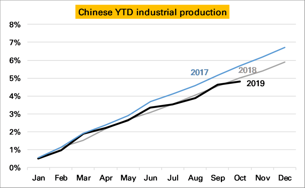
Where does that leave us? Chinese IP growth is slowing, though the YoY series might overstate the severity of the slowdown. October was a bad month, but November and December are likely to be better given the 2019 pattern so far. Given so much confusion I cling to my chart of YTD growth in industrial production derived from the monthly data. The pattern is less smooth this year but overall output has grown much the same as in 2018.
Notes:
An obvious exception being shifting annual holidays such as Chinese New Year or sometimes Easter ↩
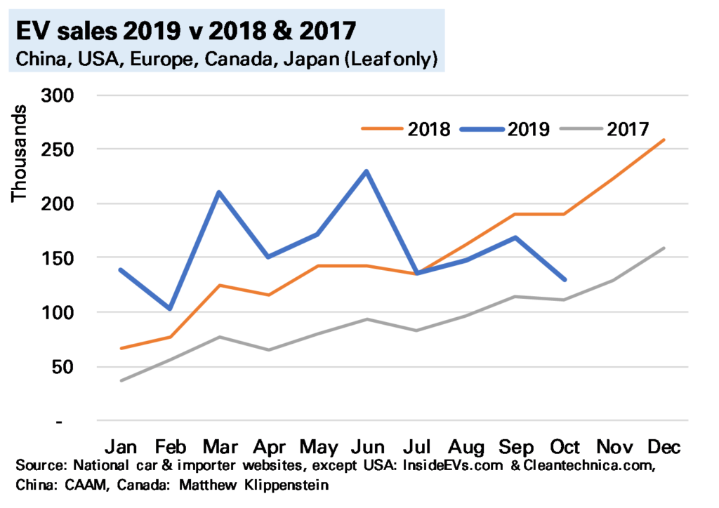
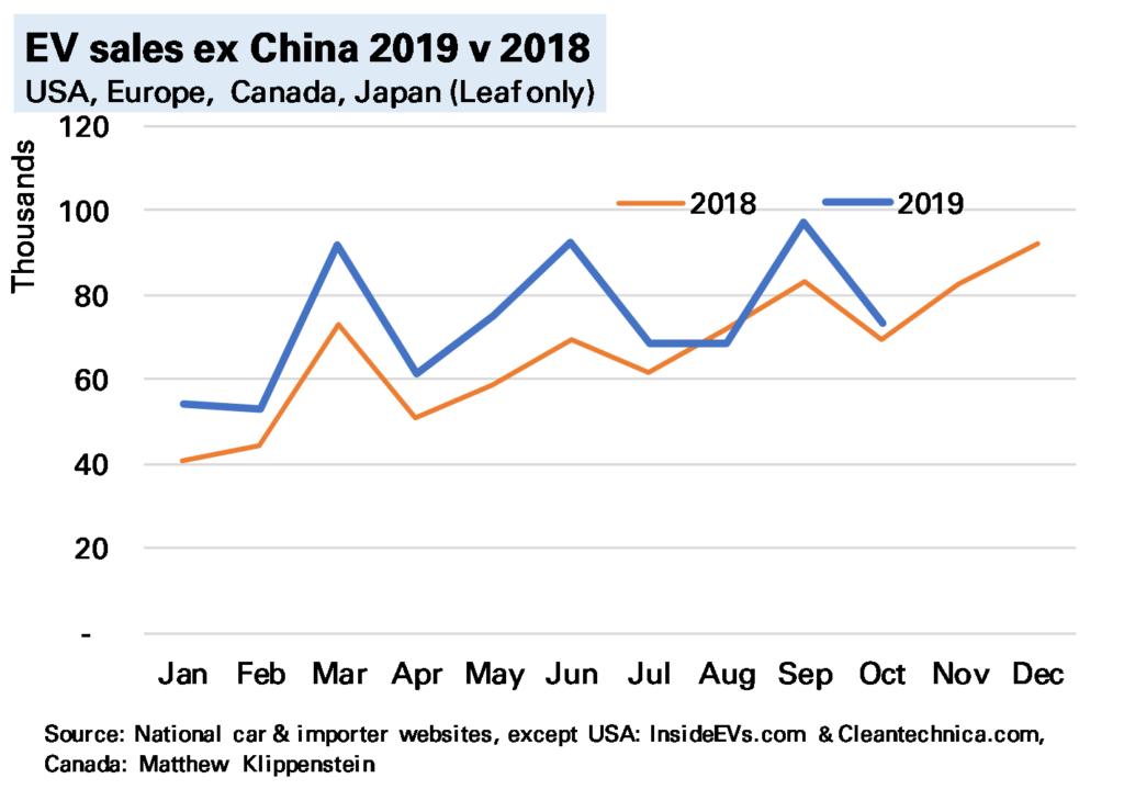
A slump in Chinese electric vehicle (EV) sales drove global EV sales into reverse in October. I estimate, using national and other sources, that 130k EVs were sold during the month (140k if you include Chinese commercial vehicles), 32% lower YoY, with both battery-electric vehicles (BEVs) and plug-in hybrids (PHEVs) down a similar amount.
The sharp global YoY fall is partly because in previous years sales have risen into year-end on a combination of beating expiring incentives and a generally rising market. But sales last month were also lower MoM, and while this owes something to wider market trends, it is mostly due to China.
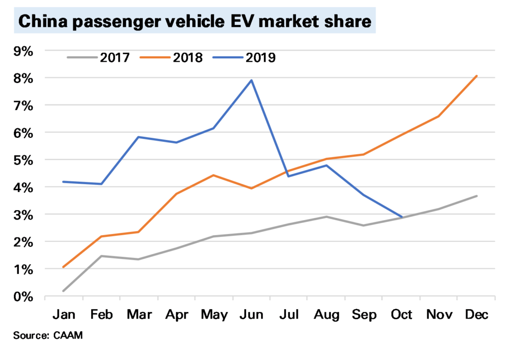
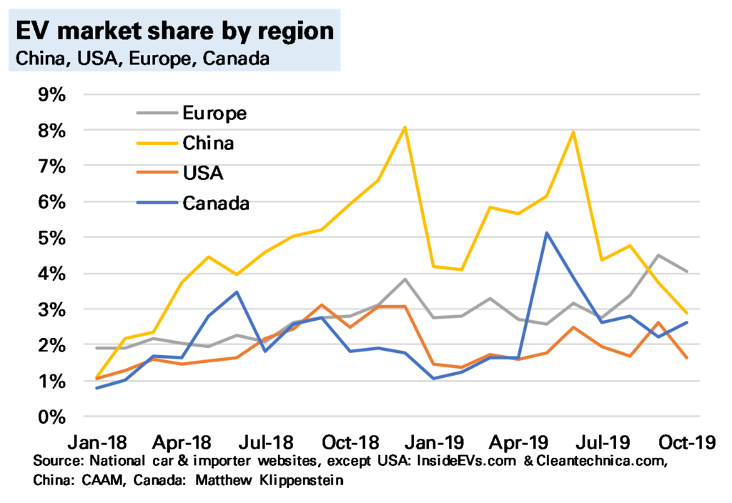
In China, which accounted for 64% of global EV sales in October 2018, EV sales were 54% lower YoY, with BEVs down 47% and PHEVs down 78%. The following chart shows this is not primarily related to a weakening wider market (all passenger car sales were down, but a more modest 6%) but a sizeable fall in market share. The reasons for this we’ve discussed many times before, and are mostly subsidy-driven, though the extent of the slump does point to some consumer disenchantment. Sales for the full-year are now only 18% YoY higher YTD and could end the year lower than in 2018.
If we exclude China then global EV sales were still slightly higher YoY, though note not by much.
The only bright spot at present is Europe (see my earlier post), where sales were more than 50% higher YoY. And while total EV sales in Europe were still lower than China in October (48k to 56k) the gap has narrowed considerably, and in terms of market share of all car sales Europe has now been higher for two months. Of course this owes something to the Tesla Model 3 roll-out, which is likely to subside, but it does suggest the dominance of the Chinese market in sales is not as obvious as once seen (of course production & battery manufacturer are different questions).
I’ve not said much about the USA, and for two good reasons. One, sales seem subdued, with Tesla concentrating on foreign markets. Two, we are lacking accurate data. The sterling work done by sites such as www.insideevs.com and www.cleantechnica.com in assessing this continues, but a decision by most manufacturers to switch to quarterly data 1 means much monthly data is now guesswork, and for PHEVs I’ve had to make an extrapolation on previous trends. This won’t make a change to our global conclusions – the US does not have a big enough market – but it does mean we need to be cautious on assessing the micro-trends.
My view on the longer-term outlook remains the same. The current slump is a reminder that technological shifts are rarely smooth, and some of the reasons for it (subsidy-issues, consumer reluctance) also point to why EV roll-out will be slower than the more bullish predictions. But subsidies are not all one way – the German government recently announced more generous ones – and consumer reluctance will be overcome by a wider and better range of models. And 2020 still seems a crucial year for that.
Notes:
There is no national or govt tabulation as in many other countries ↩
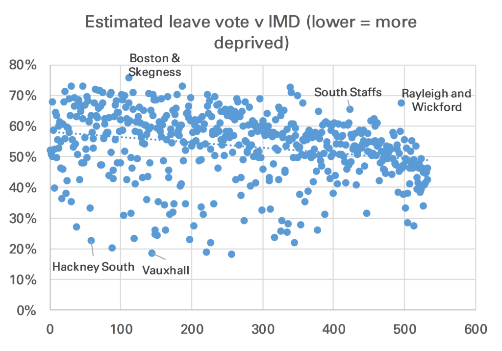
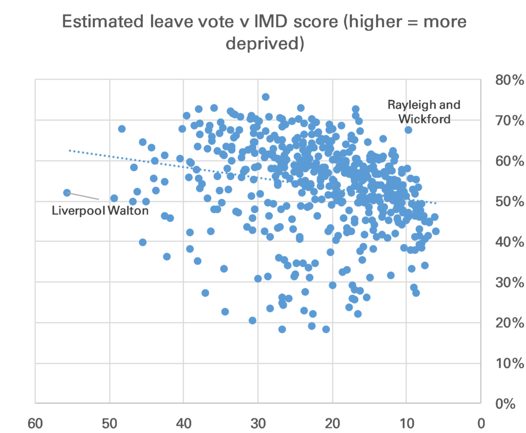
Three years late but I did this chart for somewhere else so thought would be shame to waste it. It shows for all 533 English parliamentary constituencies Chris Hanretty’s estimated (in some cases actual) Leave % vote v their ranked Index of Multiple Deprivation (lower = more deprived).
There is relationship been deprivation ranking & tendency to vote leave, though it is quite weak.
The ranking was done because that is how the original chart, which was on electoral party allegiance was done. It is more illustrative to show IMD as a score. Now the relationship 1 looks a little better but statistically it is still weak. Not lest because Liverpool Walton, by far the most deprived constituency on the IMD, only just voted Leave.
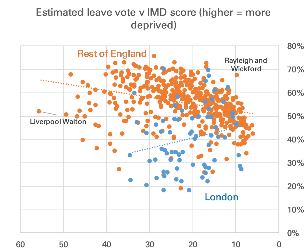
One correction that one might want to make is to show London separately. I don’t really like doing this as I’ve never bought the idea that London is that different from the rest of England. However in this case there is good reason to do so. London constituencies look relatively bad on an IMD basis, mainly because most do have large pockets of deprivation, but also because crime is high, and housing provision is said 2 to be poor.
Once you separate London the correlation between Leave vote and IMD in the rest of England is stronger, though still not overwhelming.
Finally, it’s worth noting that this analysis does not tell us which voters in each constituency voted Leave or Remain.
Notes:
Note Chris Hanretty’s estimates do use demographics within a region to help estimate vote share, though if this is a problem it would be too make the relationship look stronger ↩
I say that as I tend to think the location of a house is an important factor in its quality ↩