Brexit referendum drivers

Three years late but I did this chart for somewhere else so thought would be shame to waste it. It shows for all 533 English parliamentary constituencies Chris Hanretty’s estimated (in some cases actual) Leave % vote v their ranked Index of Multiple Deprivation (lower = more deprived).

There is relationship been deprivation ranking & tendency to vote leave, though it is quite weak.

The ranking was done because that is how the original chart, which was on electoral party allegiance was done. It is more illustrative to show IMD as a score. Now the relationship 1 looks a little better but statistically it is still weak. Not lest because Liverpool Walton, by far the most deprived constituency on the IMD, only just voted Leave.

One correction that one might want to make is to show London separately. I don’t really like doing this as I’ve never bought the idea that London is that different from the rest of England. However in this case there is good reason to do so. London constituencies look relatively bad on an IMD basis, mainly because most do have large pockets of deprivation, but also because crime is high, and housing provision is said 2 to be poor.

Once you separate London the correlation between Leave vote and IMD in the rest of England is stronger, though still not overwhelming.

Finally, it’s worth noting that this analysis does not tell us which voters in each constituency voted Leave or Remain.

Notes:

  1. Note Chris Hanretty’s estimates do use demographics within a region to help estimate vote share, though if this is a problem it would be too make the relationship look stronger
  2. I say that as I tend to think the location of a house is an important factor in its quality

The gold S&D

The World Gold Council released its 3Q demand and supply statistics today (from research group Metals Focus). The summary page does a good job in explaining their key findings.

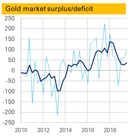
One thing I always look out for is the S&D balance, and in particular the surplus/deficit. From late 2016 the gold market entered a period of very large surpluses – totalling 361t in 2016, 336t in 2017 and 229t in 2018.

It is not clear what this was. It was not ETF demand as that is included separately. It might be what it once would have been called – “western implied investment”. But it no longer correlated to Comex positions. More likely it was to do with China, which had imported more gold than it has apparently consumed in other forms. Whether it was investment, e..g by HNW individuals, or something else, perhaps leased gold, is still unknown. But it didn’t seem particularly bullish – in fact it felt more like a classic price-weighing surplus.

Towards the end of last year the surplus began to fall. The first chart shows both the quarterly surplus, in light blue, and the rolling 12m average, both in tonnes. A big quarterly deficit in 4Q 2018 reduced the average sharply and so far this year though it has totalled 217t, that is down from 300t in the first three quarters of 2018.

So should we be concerned that the defiict in the most recent quarter, 3Q 2019 was higher than 3Q 2017 (95t to 57t)? Probably not. After all the gold price has been strong, and as such the surplus seems more likely to reflect unidentified investment. As I noted before deficits can be bearish – the corollary is surpluses can be bullish.

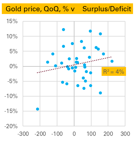
That said, the 2nd chart, which shows the QoQ change in the gold price (edit – note this is logged change) v the surplus-deficit shows little clear relationship either way (though gold’s largest price fall, in 2Q 2013, did match up to its largest deficit).

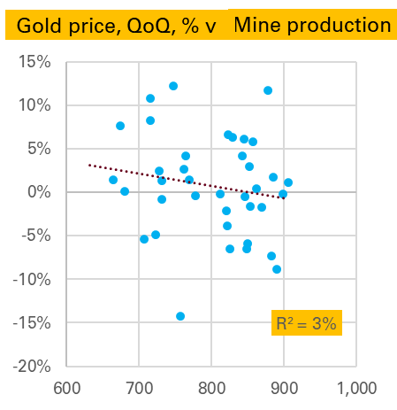
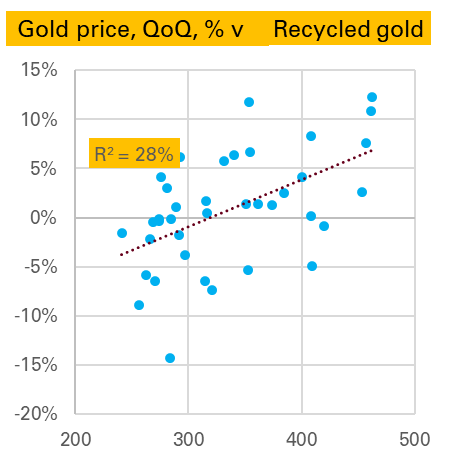
A similar analysis can be done for the other line items in the S&D balance. Starting with supply, as might be expected there is no relationship between changes in the gold price and the level of mine production 1. But there is a stronger one between changes in the gold price and the level of scrap generation 2 .

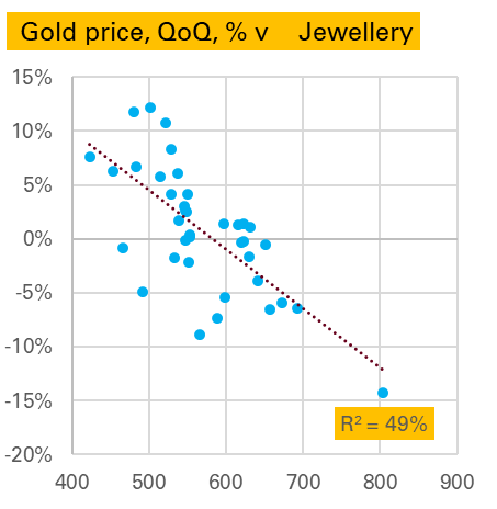
On the demand side jewellery is very interesting, with a strong negative relationship. That is in a quarter when the gold price falls a lot, jewellery demand is high, and in a quarter when the gold price rises a lot jewellery demand is weak. The causation here seems obvious, from price to demand, as the other way around makes little sense. 3. To some extent this is driven by 2Q 2013 again, though it would be wrong to exclude this as that was exactly the kind of price-driven buying we are expecting, and anyway the relationship is nearly as good if we do exclude it.

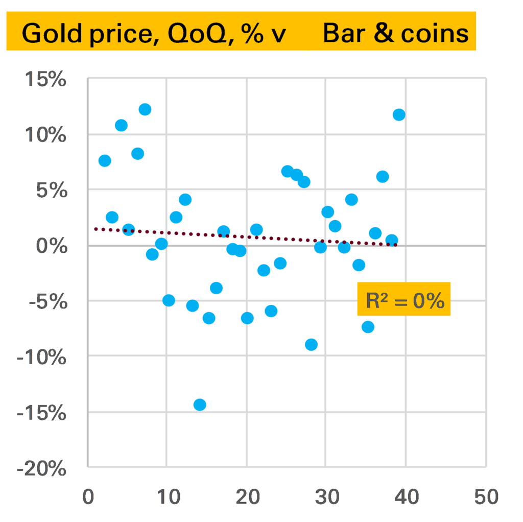
Bar & coin demand surprisingly, shows very little relationship, either in levels (shown in chart) or changes.

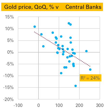
Finally we end with two strong correlations. The first is puzzling. Apparently central banks like selling gold in quarters when the price has risen and like buying it when the price is falling. This suggests a certain savviness and speed not usually associated with the official sector, but might be explained by them targeting a fixed $ amount of gold. More research is needed – and indeed more quarters in which central banks are net sellers, with only one datapoint since 2010.

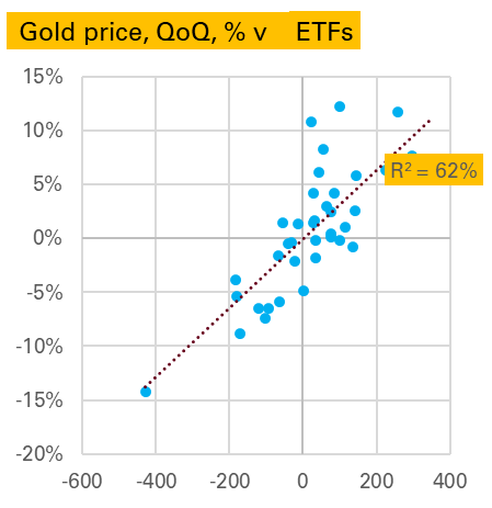
The next is more intuitive. ETF flows are much larger in quarters when the price is rising and lower when it is falling. Are investors trend followers? More likely they are price-setters, with large short-term physical flows driving the price in either direction.

Source: All charts World Gold Council, Gold Demand Trends (data from Metals Focus)

Notes:

  1. If you think it would be stronger against the change in mine production – it’s not
  2. Here though, and elsewhere, there is probably some modelling relationship being captured given the difficulty in directly measuring such flows
  3. Interestingly this correlation is strong, but not stronger, if we use the change in demand

Chinese gold imports remain subdued

China imported 62t of gold in September, according to recently released customs data. This is slightly down on last month, above the lows of summer, but subdued compared to earlier in the year and in 2018.

Source (this and all other charts): China Customs, SGE, Matthew Turner, October 2019

Gold imports in the first nine months of the year have totalled 760t, more than a third lower than the 1,242t seen at the same point of 2018.

Of course one factor is the much higher gold price, with western ETF investors bidding up the price.

But in terms of value of gold imported 2019 is also proving a weaker year than 2018, and even, since the start of summer, with 2017.

Is this something for the bulls to worry about? This Reuters story placed the blame for the very weak summer period on quotas restrictions aimed at restricting the outflow of Yuan. These were apparently eased in August, helping explain why imports have picked up a bit. Presumably at the LBMA conference in Shenzhen more was said about this. Such restrictions do suppress gold demand but if only temporary are unlikely to do lasting damage.

Furthermore there is a real sense, despite all the talk of gold being a 200,000t “stock” market, that if ETF investors are buying a lot of gold, the Chinese can’t have as much. The price rises to see who wants it most. So it’s certainly not as concerning as it looks.

Nevertheless it remains concerning. The biggest risk to the gold market medium-term, in my view, is lacklustre”physical” demand, of which over 50% comes from China and India. In particular it seems to me that gold – both as a consumer good and an investment good – now faces far more competitors (eg smartphones, index-linked bonds) than it once did. Of course some of its qualities are unique and it has a long track-record, suggesting a certain robustness. But it pays to not be complacent.

For the background on how China now publishes gold trade data see my LBMA Alchemist piece from earlier this year.

Chinese industry recovers as expected

Last month I suggested that Chinese industry was not doing as badly as the August year-on-year (YoY) series suggested, a rise of just 4.4%. This was because the seasonally adjusted month-on-month (MoM) series, theoretically a much better guide, implied a higher YoY rate of 5.5%.

September’s data was released today and shows the YoY series rebounding more strongly than market expectations, now up 5.8% YoY.

In part this was because September saw a strong 0.72% MoM increase.

Source: NBS, Matthew Turner, October 2019

But it also looks like some catch-up with the implied YoY series.

Source: NBS, Matthew Turner, October 2019

Year-to-date (YTD) Chinese industry is actually slightly outperforming how it did in 2018 using this MoM data*.

* Of course one might not believe any of the data series.

Still evidence of no palladium substitution

I wrote two weeks ago (“No evidence of substitution away from palladium. Indeed, evidence of no substitution“) that a natural experiment – North Macedonia trade data – could tell us whether high-priced palladium was being replaced by cheaper platinum in diesel autocatalysts.

Answer: it wasn’t and that was a good reason to think the price of palladium could go higher. And indeed it has gone higher, now nearing $1,800/oz.

We now have North Macedonia trade data for August. Does this show any shift towards platinum? Nope. Palladium was 44% of the palladium & platinum imported, higher than the YTD average of 36%. This reinforces the point that 2019 is on course to see palladium’s share rise not fall.

EV sales – Europe catching up

While global EV sales were disappointing in September, down 11% YoY, those in Europe continue to soar, gaining 82% YoY. And while Europe remains far behind China in EVs sold YTD, at 369k cars, to 792k, in September the two markets were much nearer, at 58k to 72k. In market share, Europe was even a little higher than China, though I wouldn’t want to make too much of this, given I exclude from the totals some smaller EV markets where by definition market share is low.

Will this continue? It’s unlikely. Europe’s EV sales are rising, helped by subsidies and new model launches, though September is likely to prove exceptional given a backlog of Model 3 orders. And Chinese sales should improve into year-end, if not at the same pace as in previous years.

Source: National car data, Insideevs.com, Matthew Turner, October 2019

IMF notices precious metals

In today’s latest World Economic Outlook (WEO) the IMF devotes a large-ish section to gold and other precious metals (p.47 onwards here).

Perhaps the most interesting section is on whether they serve as an inflation hedge. Finding a positive but weak correlation to inflation itself, the analysts also look at gold prices against modelled inflation risks. Here they are more positive, saying:

Results of the analysis support the view that precious metal prices react to inflation concerns… An increase in inflation uncertainty by one standard deviation tends, within a month, to raise the price of gold by 0.8 percent and silver by 1.6 percent. A decline in inflation uncertainty can explain half of the observed gold price decline of the 1990s and one-third of the price rise after 2008. The role of inflation uncertainty is, instead, positive but not significant for platinum and palladium, yet irrelevant for copper

For many gold’s main advantage is not inflation but against systemic risk. The IMF also looks at this through reactions to S&P 500 moves. This is something I have long done, and the IMF’s conclusions are the same – gold does act as a safe haven when the S&P 500 falls, silver does but less so, and the other metals do not. Here’s one of my versions of this table.

Finally the IMF also mentions precious metals’ sensitivity to dollar moves. But only to express surprise the beta can sometimes be more than 1 (ie if the dollar falls 1%, gold rises more than 1%). I think this relationship – which is partly obvious given we are quoting the price in dollars – needs more discussion and will do so in a later post.

October EV sales continue lower YoY

Globally 170,000 electric vehicles (EVs) were sold in September, 11% lower YoY, with pure EVs (BEVs) falling YoY for the first time. This I calculate using national data released in the last two weeks.

Regionally there was a very strong performance in Europe, where YoY sales were up 82% YoY (note revised from 75% in the linked article), boosted by pent-up sales of Tesla’s Model 3. However in the USA weakening sales of the Model 3 compared to its own, earlier, 2018 boost was a major factor in EV sales falling 26%.

But the biggest impact on the global numbers remains China, and there sales of EVs were very weak, down 34% YoY. With China accounting for around half of global EV sales in September 2018 (and still more than 40% in September 2019) this clearly dragged the global total down.

All Chinese car sales were down 6% YoY, but the slump in EV YoY is more due to reduced subsidies and perhaps some signs Chinese consumers are worrying about value for money, especially resale value. It’s also exacerbated by the strong start to the year and the exceptionally strong end-year performance seen in both 2018 and 2019, which seems missing this time around.

Deficits can be bearish

In commodity markets it seems widely accepted that market deficits are price bullish and market surpluses price bearish. Intuitively this feels right. A deficit is when demand is higher than supply and inventories (stocks) are falling. Such a situation cannot go on forever, as stocks are not infinite. Ultimately demand has to fall or supply has to rise, and in the absence of other factors (recession, technology etc) the way this happens is via a rising commodity price.

In practice it is not so clear cut, and the easier it is to hoard the commodity, the less clear cut it gets. For metals, and particularly precious metals, where hoarding is not only easy but often desirable, the picture is very muddy indeed.

Take this S&D for Metalium, a made-up industrial metal. In 2019 1,000 units were supplied by mines, 1,200 were demanded by industry. This makes a deficit of 200, or put another way, a fall in stocks of 200. If I asked you what happened to the price in 2019 you would probably assume it moved higher.

Bullish? Bearish?

But what if I then told you that actually what happened was industrial users midway through 2019 saw that 2020 was set to be a very bad year for demand and decided to reduce their stocks by 200?

This now seems bearish! Most likely those 200 units flooded the market, pushed the price lower, boosting industrial demand and reduced mine supply.

In other words whether a deficit is bullish or bearish can depend on the reason stocks are falling.

In base metals, where stocks are mostly held within industry and are relatively stable, this latter scenario might not be that common. But in precious metals it happens all the time, as the stockholders are not industrialists but investors. If in an otherwise balanced market a very large investor decides the future of platinum is bleak and sells their holdings of 1 Moz, the market will be in a 1 Moz deficit but the platinum price will be a lot lower.

So on a static snapshot, market deficits are not necessarily bullish. But maybe we can at least say that they imply a higher future price? After all as we noted at the beginning of this piece, stocks are not infinite. A deficit might reflect a bearish investor throwing in the towel, but they can’t keep throwing in the towel. Ultimately there will come a point when there are no more stocks (or no-one wants to sell their stocks) and the commodity price will have to rise to bring supply and demand back in line.

This is more justifiable, though still not always true. Consider these two scenarios:

  • The industrialists or investors are right in their pessimism, and so a deficit in one year is followed by weaker demand or higher supply in the following year. In this scenario prices don’t have to adjust upwards.
  • The sale of stock is, in itself, new information that changes perceptions. An example would be if a European central bank announced, out of the blue, it had plans to sell gold.

Finally, for gold, where almost all demand is stockbuilding (by investors, but also by people in the form of jewellery) deficits and surpluses are even less well defined. I’ll have more to say about that in another post.

European EV sales in September super strong

After a few months of a weakening trend, European electric vehicle (EV) sales in September roared (or maybe whined?) back, up a remarkable 75% YoY, led by a 112% gain in pure EVs (BEV) and with even plug-in hybrids (PHEVs) higher YoY.

I estimate total EV sales in the region were just under 58k, nearly matching the highest month in history, March 2019.

Source: European car association data, Matthew Turner, September 2019

What was behind this performance? That it was nearly a record month is partly sign of the market maturing. March & September are traditionally the strongest month for all new car sales in Europe, with number plate changes (particularly in the UK). It now looks like buyers are waiting for these number plates to get EVs too. The YoY acceleration is more interesting. Partly this was because it was a strong month anyway for all new car sales after a weak September 2018 on emissions changes – up 12% YoY on my estimates. Specifically, however, the roll out of Tesla’s Model 3 to Europe continues to have an outsized impact on EV’s market share.