No evidence of substitution away from palladium. Indeed evidence of no substitution

The palladium price has hit a new record high in recent days over $1,700/oz, and the FT has declared there’s more to come unless we see a global recession or substitution of much cheaper platinum. I agree. And yet at present not only is there no evidence of substitution but there’s evidence that there has been no substitution.

It comes from North Macedonia.

This country had little to do with the global PGM markets for much of its history. It is not a producer, and in 2009 reported imports of unwrought PGMs of only $1. That might sound a little implausible, but probably not far from correct – in 2008 PGM imports were less than $20,000.

And yet in 2010 it imported over $100m of PGMs. And by 2018 this was over $1bn, with more than 1 Moz of PGMs imported. This year is approaching $1.5bn.

Source: UN comtrade, Matthew Turner. Note 2019 extrapolated from first 7 months of the year.

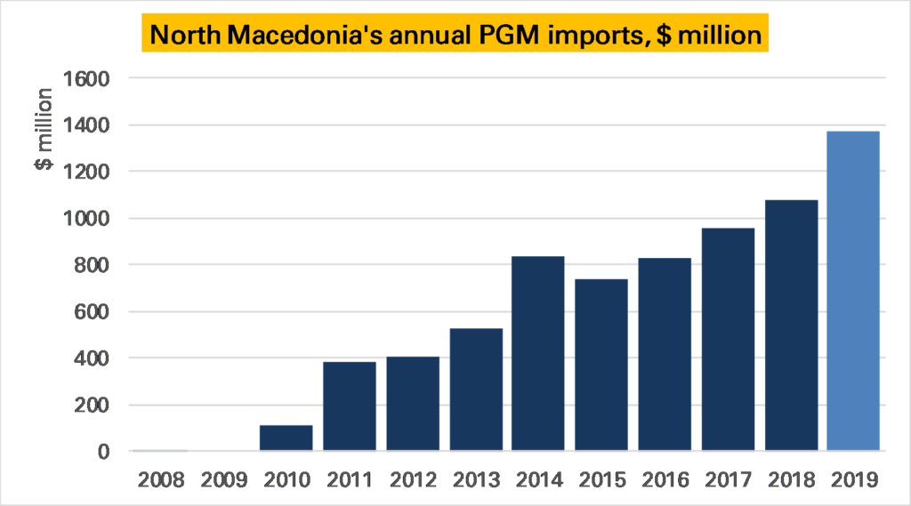
What gives? In 2010 refiner Johnson Matthey (JM) opened a diesel autocatalyst plant, which was expanded in 2013. This is why North Macedonia’s exports of catalysts also exploded, rising from nothing in 2008/2009 to nearly $2bn in 2018 (Macedonia has not gone its own car industry).

Source: UN comtrade, Matthew Turner. Note 2019 extrapolated from first 7 months of the year.

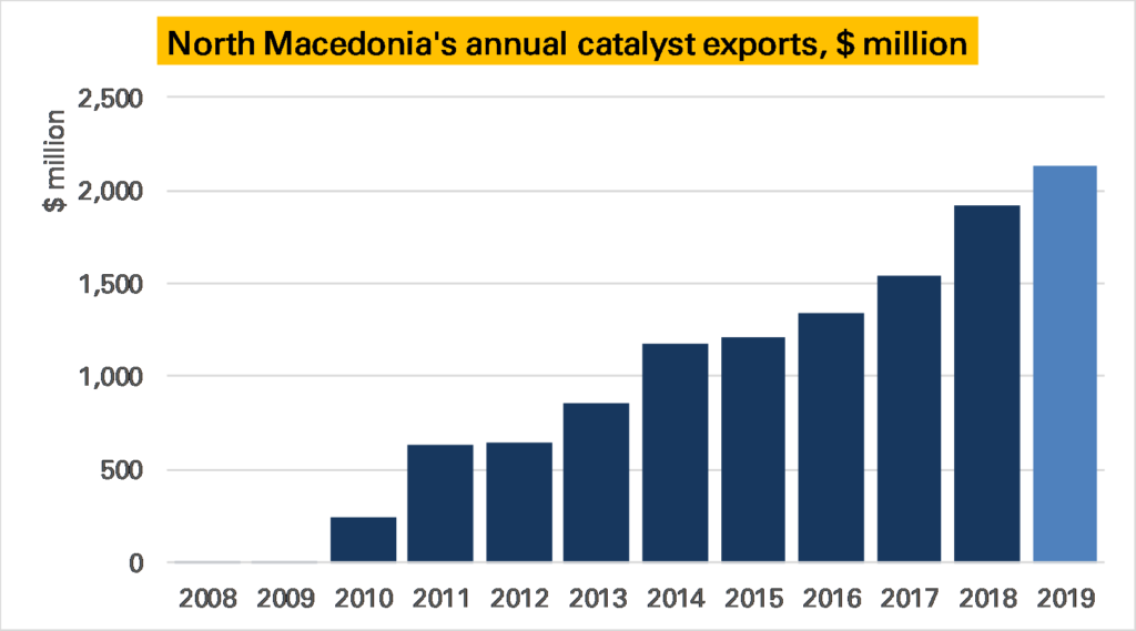
This is great for an analyst. Other large catalyst manufacturing countries are also PGM traders, such as the UK, and/or jewellery consumers, such as the China and the USA. This means it is hard to draw firm conclusions from trade data. But in North Macedonia it is just catalysts – therefore it is safe to assume the imported PGMs are being used in that sector.

As such because we can break the trade data out by metal we can use it to estimate what proportions of platinum and palladium JM are putting in their catalysts. If we look at its imports by volume, we see that more platinum is imported than palladium – in 2018 nearly 800 koz of the former to around 350 koz of the latter – making palladium 28% of the combined volume to platinum’s 72%. This is to be expected given the plant is producing diesel catalysts. But importantly this proportion of palladium in the mix doesn’t seem to have fallen in the last few years – indeed it modestly rose from 24% in 2015*.

Source: UN comtrade, Matthew Turner. Note 2019 extrapolated from first 8 months of the year. This chart was corrected on 23-10-2019 as date axis misaligned and so includes August data.

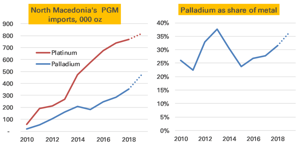
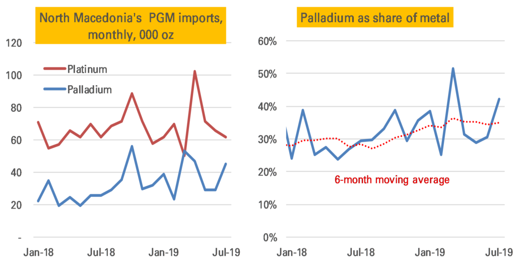
Perhaps the shift has only happened in the last few months? Not that either. Indeed while monthly import data is quite volatile, if there is a clear trend it is the other way, with palladium seeing a share of 50% in one month.

Note: The right-hand chart on 24-10-2019 replaced an earlier one which in error showed palladium relative to platinum, not as a share of all metal.

This data can’t prove no substitution is taking place. There could be other effects masking it, for example if JM have been importing additional palladium than they are using in catalysts (indeed it looks likely), perhaps ahead of the rising price or Brexit. It also might be that the mix of heavy and light vehicle autocatalyst could have changed, affecting the ratio (that’s what seems to have driven palladium’s share down in 2013 after the plant’s first expansion). And if the plant had begun manufacturing gasoline catalysts all bets would be off, though then we would also see rhodium imports, and we have not.

We also can’t assume that JM’s Macedonia plant is representative of all their catalyst plants or those of other catalyst manufacturers. And it is possible substitution is happening in gasoline catalysts, not diesel ones.

Nevertheless it is strong evidence that there has been no substitution. After all most analysts believe if substitution is to come it would come first in diesel, where car and catalyst makers are most comfortable with using platinum.

The palladium price could be going higher yet.

CBGA ends amid a changing world of official sector gold

Today marks the last day of the European central bank gold agreement (CBGA).

Announced on September 27 1999, and renewed at five-year intervals up to 2014, this was often described as a pact to limit central bank gold sales and lending, though arguably its main role was to improve market conditions sufficiently to give space for hefty European sales. From around the mid-2000s European central banks lost interest in selling gold, and as such the pact became rather pointless, the main reason why in 2019 it wasn’t renewed.

Central bank’s attitudes to gold have changed significantly since 1999. Back then global central bank gold holdings still largely reflected the relative economic strengths of countries at the end of Bretton Woods era (1970s). 85% of the world’s 30,300 tonnes of official gold (excluding that held by the IMF & BIS) was owned by the “Advanced Economies”, and almost all of that, 80% of the world, by the USA and Western European countries.

This geographical skew can be seen clearly in the following map, where I’ve resized the countries of the world by their official gold holdings – shows this clearly (ignore the colours)

Central bank gold holdings by country, September 1999 (source: IMF, Matthew Turner)

Fast forward 20 years and a map redrawn to reflect August 2019 gold holdings and at first glance nothing much has changed – the USA and Western Europe still dominate, even if the latter is somewhat smaller.

But look a little more closely and now Russia and Asia are far more visible.

Central bank gold holdings by country as of August 2019 (source: IMF, Matthew Turner)

This is because there has been a slow shift since the first CBGA was signed in 1999. The “Advanced economies” have sold nearly 4,000t, mainly through the CBGA – with gold holdings in the Eurozone down nearly 1,800t, in Switzerland 1,580t, and in the UK over 300t. Their share is now 70%, down from 85% in 1999. But globally gold held by central banks is up around 1,000t – because “Emerging and developing” economies have added nearly 5,000t. Russia and other CIS countries have been at the forefront of this, but China has also increased its reserves dramatically, and so have a reasonably wide range of other countries, including India, Mexico, and Thailand.

This shift is likely to continue. Certainly central banks are still buying, as noted in Tuesday’s post, with 1H 2019 seeing a record amount. This trend has many drivers but a slow – very slow – loss of faith in the US dollar seems behind some of it, not just in Russia. We’ve not seen any evidence of European selling resuming, indeed the main activity there purchases this year and last by Hungary and Poland. However I would think in another 20 years Western European gold holdings will be lower than they are today.

August: central banks keep buying gold but some signs of fatigue

One of the reasons to have been bullish gold over the past 12 months was an apparent step-change in central bank purchases. Not just were traditional buyers such as Russia and China continuing to add to their holdings, but new names were getting involved, including – gasp! – even European central banks.

But after a tremendous 1H, in which net purchases reached nearly 400t, or 65t/month, there does seem to have been a slowdown in recent months. From latest IMF data (and direct central bank publications where necessary) I estimate 22t was purchased in July, and just 16t in August. The YTD total is now 423t.

It is likely these numbers are revised higher. Many countries report late, and given a general bias towards purchases this should mean more to come. In particular Turkey, which has added roughly 9t/month this year, hasn’t yet reported for August. Furthermore central bank gold buying has always been lumpy, for example Poland’s 100t purchase this year mostly in June, and so you do get quiet months.

Nevertheless even those buyers who were buying bought less, with just 11t from Russia and 6t from China in August. Furthermore Uzbekistan has sold quite heavily in recent months. The very high gold price, particular in non US dollar currencies, is perhaps having an effect.

Do Americans still work harder than Brits?

The advocacy of a four-day working week by the Labour Party’s shadow chancellor, John McDonnell prompted a commentator to say that the one bulwark against the Americanisation of the UK economy was that the British were a bunch of slackers, at least compared to the industrious Americans.

This got me thinking. We all know that Americans work longer hours – the OECD in 2018 puts the average working year at 1,768 hours, 15% higher than the British who put in 1,538 (incidentally about the same as in France; it’s Germany which has the really short hours at 1,363). This difference of 230 hours is about 5 hours extra per work, or the equivalent of about 7 weeks holiday untaken.

See here for chart.

However, fewer Americans now work at all compared to the British. The employment rate, which measures what proportion of people of working age population are in fact working, is just 71.1% in the US, compared to 75.1% in the UK.

See here for chart

If we multiply hours worked by % working we should get the average hours worked per person of working age population. For the US this is 1,768 x 71.1%, or 1,257 hours a year. For the UK it is 1,538 x 75.1%, or 1,155 hours. So the Americans still have it, but by a narrower amount of 9%.

It might even be closer than that. It is hard to be sure definitions are the same between the two countries. If we look at total hours worked in the economy, in 2018 it was 254.6bn in the US and 54.0bn (1,038*52) in the UK. The number of adults in each country is quite hard to find out, but seems to be 253m in the US, and 52.5m in UK. This suggests a very similar number of hours per person over the age of 18* of 1,028 in the US and 1,006 in the UK.

I’m not sure why this gives a more similar figure than the other method. The main difference is it includes pensioners, but this should boost the US total (there are fewer of them, but they work more than in the UK) So it might be due to differences in definitions around ages, or something to do with the military.

Either way the Americans do still work longer hours than the Brits. But there isn’t much in it.

How bad is German industry?

September’s flash German manufacturing PMI came in at 41.4, the weakest print in 123 months (that’s 10 years, 3 months, so back to the GFC).

The reason we pay attention to PMIs is that they are much more timely than official data. Today’s PMI is for September, the manufacturing output data it is meant to foreshadow is available only to July.

What it implies, therefore, is more weakness to come. The relationship of the PMI to actual manufacturing output is not hard and fast – but closest at the YoY level (somewhat of a puzzle, though perhaps that is how purchasing managers think). A print of 41.4 historically is consistent with a 10% YoY slump in output, but we can’t be confident in that given the limited number of datapoints available (for example in 2012 such a relationship would have been too pessimistic). A safer conclusion is that we are very unlikely to see any German output growth over this period.

Source: Markit

How bad is Chinese industry?

Chinese industrial production (IP) growth slowed in August to just 4.4% Year-on-Year (YoY), which is a 17-year low.

Source (this and all charts): National Bureau of Statistics

We need to keep in mind that this data is not seasonally adjusted and can show some wild swings. This is especially true in February and March, when the shifting dates of Chinese New Year have a large impact. Only five months ago in March 2019 IP growth was reported as up 8.5% YoY, clearly an aberration.

What we need is an estimate of the level of Chinese industrial production. But the National Bureau of Statistics (NBS) does not publish one.

What it does publish, however, is a seasonally adjusted month-on-month (MoM) growth rate. This too is rather odd, showing distinct seasonal patterns, but in 2019 has also been trending downwards. In August it was just 0.32% MoM, the slowest rate in the last three years and a mere 4% annualised.

The MoM series can be used to back out a level of IP, and from this an alternative YoY growth rate. It is noticeable this paints a less pessimistic picture than the official YoY series, showing in August a YoY rate of around 5.5%. But it is also true that this backed-out series has been higher than the official series for much of the last year, somewhat of a puzzle.

Interpreting Chinese data is never easy, even if you accept them at face value. From the NBS’s two series it seems safe to conclude IP growth is slowing, though perhaps not as severely as the YoY numbers suggest. On a YTD basis industry has expanded not much less than in 2018. But the last two months have been weak. September’s data will be interesting.

A million European EV sales in 2020?

The FT quotes (limited paywall) environmental group Transport & Environment that they expect EV sales in the EU to pass 1m next year, from 250,000 in 2018 and 200,00 in 1H 2019.

This is an aggressive forecast. I don’t have the same historical numbers as they do, even excluding Norway and Switzerland from my data. Perhaps this is because the article says they include PHEVs only with a “significant range”, though I’d have thought that was to exclude mild-hybrids. But in any case my rule-of-thumb of 40% annual gains, similar to the YTD position, would imply (on their numbers) 350k this year, and just under 500k next. Much less than 1m.

Clearly the launch of new models such as the VW ID3 will make a big difference, but my understanding is that won’t be available in large numbers until later in the year. I’ll try to find out more information on their assumptions.

ps Here’s their press release and there seems to be a report. On a quick glance it looks like it might be a “look this is possible” target rather than an expection.

Investment experts – as of 1964

The Golden Eggheads

Fascinating BBC documentary from 1964 about the state of the art in investment advice. It starts off in a gold vault but soon expands to cover technical analysis, Professor RF Kahn (of multiiplier fame), an M&A Boutique and some leading fund managers of the day.

The narrator seems close to saying it is all guesswork at times. How things change.

EV sales need a recharge

The impressive growth in global* electric vehicle sales came to an end in August, with a 9% YoY fall (updated from a 2% gain after the release of further data).

147k EVs were sold during the month: 111k battery-electric vehicles (BEVs), up 4% YoY, and 36k plug-in hybrid electric-vehicles PHEVs), down 34% YoY.

This slowdown in global sales growth can be attributed to:

  1. A fall in China post subsidy changes (down 12% YoY in August), which had also brought forward some sales. This matters as China still accounts for more than half of all EV sales.
  2. Slightly slowing growth in Europe (21% YoY in August) despite the Tesla Model 3 doing well, and, most important in August;
  3. A fall in USA sales as Teslas are diverted to other markets (down 24% YoY in August). An important caveat here: US sales data has become harder to compile in recent months as automakers have revealed less information and (building on www.insideevs.com efforts) I’ve had to estimate some of the smaller selling models. However there’s no doubt sales were lower YoY.

In terms of market share China remains ahead (though obviously some European states such as Norway are individually much higher). Canada’s share was boosted by high Model 3 sales. Europe’s continues to steadily rise, supported by generous subsidies.

Looking ahead, should the weak August numbers shift our longer-term expectations?

Yes, and no.

Yes because it seems unlikely 2019 global full year sales will be able to match some of the earlier targets. YTD sales remain 35% higher, but if sales growth is flat from now until December it would end the year up less than 20%. And it is always risky to ignore actual data: what this year’s ups and downs have shown is that the market remains rather niche: subsidy driven and dependent it on new models.

But no because while subsidies will continue to decline, new model launches are going to multiply. In particular lower cost EVs from established manufacturers, including the potentially game-changing VW ID3 (shown at this week’s Frankfurt motor show) will finally come on to the market in 2020. Ultimately this is what will drive EV market share higher.

Sources: USA – www.insideevs.com, Europe – national car & dealer associations, China – CAAM, Canada – Matthew Klippenstein. * Global = China, USA, Canada, Europe and Japan (Leaf only).

European EV sales slow

The long-awaited unveiling of the VW ID3 at the Frankfurt motor show (https://lnkd.in/e6XS89p) feels like the launch of a new chapter in European EV sales.

It comes at a good time as European EV sales growth continues to slow. In August I calculate (from national data) that YoY growth was just 21%, 75% increase for BEVs offset by a 27% fall in PHEVs. This was despite a near five-fold increase in the UK as right-hand drive Tesla Model 3s arrived. Market share remains robust, however, as overall car sales were down 8%.